
BRAND PRINT AND DIGITAL
Print and Digital Art Direction and Graphic Design ranges from magazines, printed brand collateral, packaging, and digital social assets. It’s my goal to always cater to the aesthetic of the client while delivering the best iteration of their brief.
-
It all begins with an idea. Maybe you want to launch a business. Maybe you want to turn a hobby into something more.
-
It all begins with an idea. Maybe you want to launch a business. Maybe you want to turn a hobby into something more.
-
It all begins with an idea. Maybe you want to launch a business. Maybe you want to turn a hobby into something more.
-
Item description
-
Digital design covers social media marketing, digital ads and banners.
TILLAMOOK BLOCK JAMS CAMPAIGN ART DIRECTION AND VISUAL CENTER
For Tillamook’s Block Jams campaign I was initially pitched a retro music themed campaign- from there I led the Visual Art Direction from concept through execution, developing a retro 70s/80s narrative inspired by VHS graphics, van striping, and boombox culture. The campaign centered on a cheese block boombox, creating a playful and expansive narrative for the summer Block Jams universe. I designed the full suite of visual assets—including logo, musical notes, and a pattern that tied into the broader brand refresh—alongside applications such as a T-shirt, promo box, mini mic cheddar block ( manufactured by PFG), boombox lunchbox (manufactured by PFG), and out-of-home billboards. The graphics and visual language were featured in the Block Jams commercial, with the campaign extending into a Hudson Yards experiential event and Summer Food cart showcased in my graphic experiential section.


NYC Hudson Yards Pop Up- for full graphic description and more images check out my graphic experiential section.

Creamery Food Truck- for full graphic description and and more images check out my graphic experiential section.


TILLAMOOK BRAND ART DIRECTION
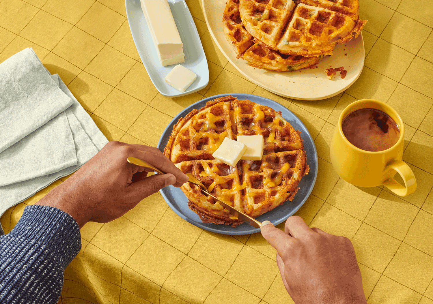
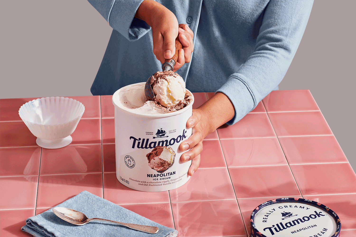
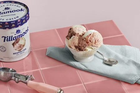
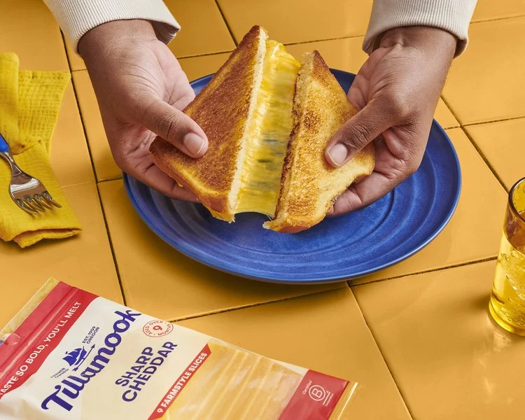
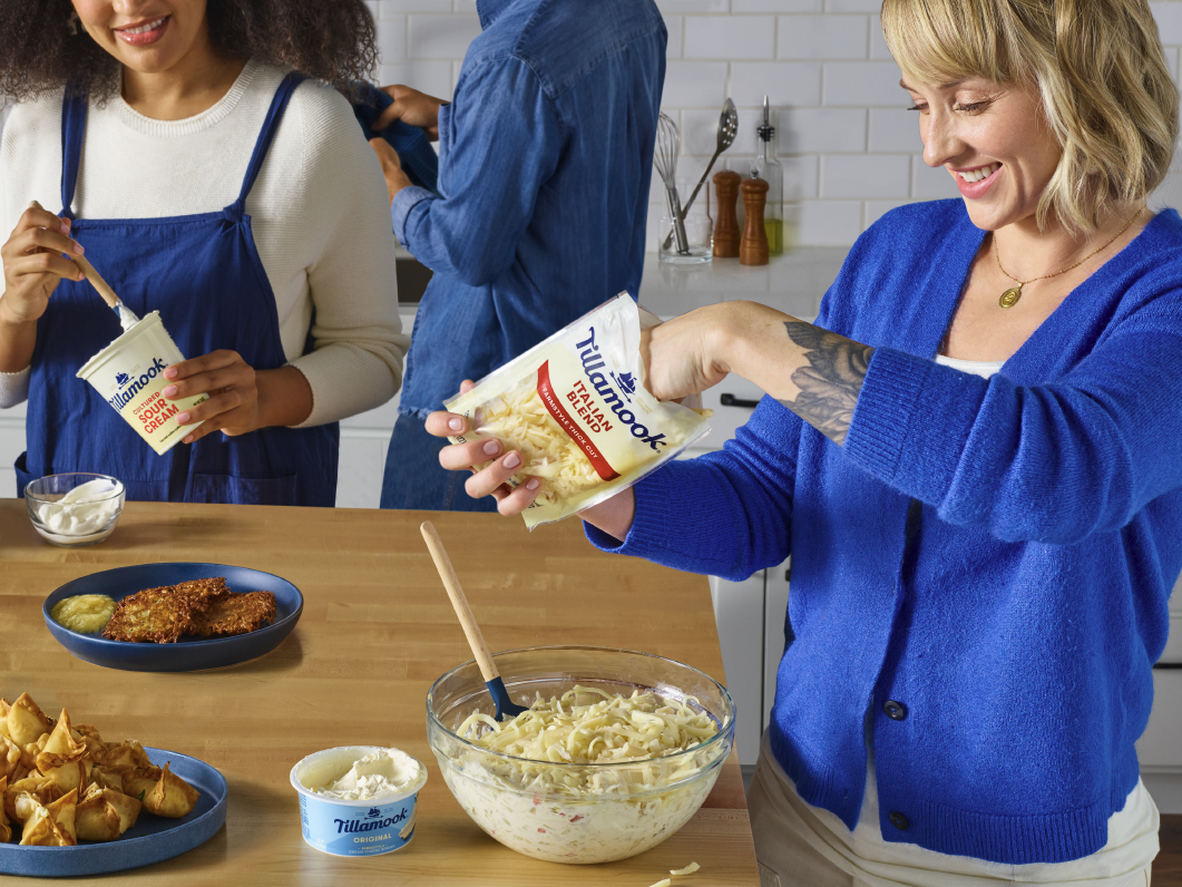
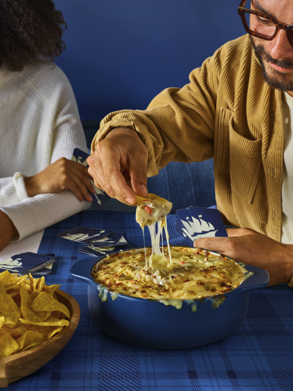
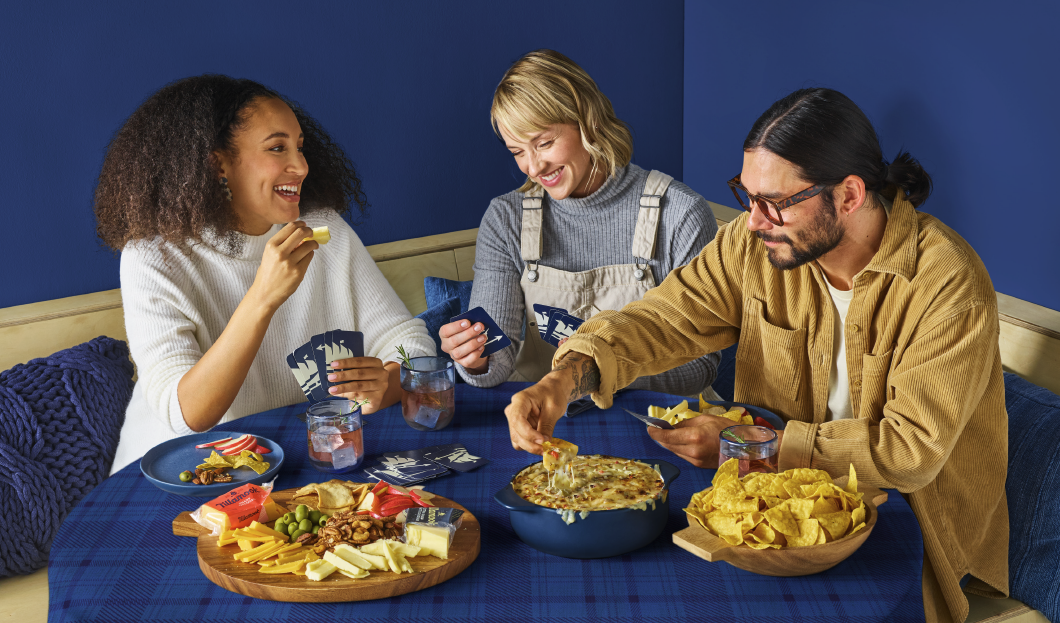
A new brand art direction, centered on using product colors as the foundation for visual language across social media marketing and campaigns. I introduced fresh, contemporary layouts that simplified the brand’s previous approach into something more streamlined and modern. Typography and a refined color palette were applied consistently to reinforce the new direction across all touchpoints. Each campaign carried a distinctive look and feel, with product colors echoed in the surrounding space, props, and geometric placements—creating cohesive, visually striking storytelling that highlighted the product at the core. The core product photo shoot played with the visual language direction to emphasize the new brand direction, creating a visually playful world.


TILLAMOOK HOLIDAY ART DIRECTION
For Tillamook’s Holiday campaign, I created a distinctive art direction using the previous brand direction centered on a plaid-inspired color story. Working with limited resources, I developed playful, easy-to-read layouts that leaned on color and pattern to carry the broad seasonal theme. From start to finish, I guided the entire photo shoot process: building the art direction deck, hand-picking the models, sketching out potential shots, and collaborating closely with the photographer to shape the final imagery. The result was a cohesive campaign that maximized impact while staying holiday neutral to accommodate winter and holiday Shopper ads.


TILLAMOOK X TIMBERS SCORE BOARD ART DIRECTION
What began as a static image evolved under my Art Direction into a more dynamic way of capturing the excitement of the game. For each Timbers goal, fans are signaled by a banner fall, with each Tillamook flavor representing a specific score. I story boarded and directed seven digital flags, creating a game-appropriate brand expression that plays across an 18-foot-wide by 42-foot-tall LED video wall. The concept was inspired by the dramatic flag drops seen in Harry Potter’s Quidditch matches, re-imagined for a high-energy, real-time sports environment.


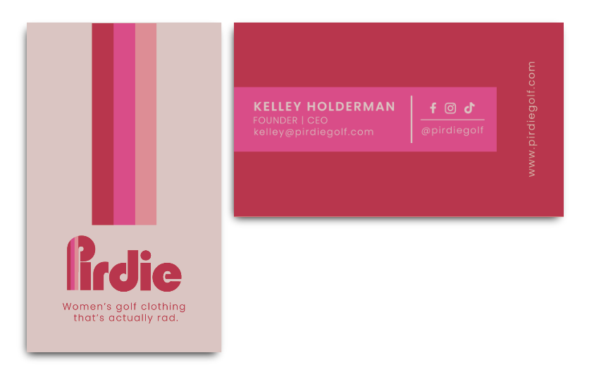
PIRDIE
An all women lead golfing brand looking to make a statement. Pirdie brings a new spin on the retro vibes of California. Pirdie’s projects range from custom promo branded tee cards to general branded collateral. Check out the apparel section to see apparel and headwear i’ve designed for Pirdie.


DESCHUTES PINEAPPLE WHIP FRUIT POP
An ale brewed with pineapple juice and vanilla flavors designed with the illustrative type in mind. I wanted to create a visual representation of the Pineapple Whip Fruit Pop name inspired by 50’s ads.
CONCEPT EXPLORATION EXAMPLES:
HOLYPEACH ZINE
An Art focused magazine highlighting local venues, artists, tutorials, and creative outlets. The zine was designed with an art aesthetic, highlighting each page with a large range of color palettes and bitmap textures. The mulit-edition zine includes varies layouts and type solutions.
DESCHUTES CATHARINA GUAVA SOUR
The Xicha x Deschutes collab centered around the aromas of guava and sweet tropical notes. The graphic focused on a typographic play combining three hand-rendered typefaces of varies styles and with a pop of guava inspired colors.
CONCEPT EXPLORATION EXAMPLES:
WUNDERBE
A children’s apparel and art subscription box kit centered around design. It’s all about the fun, the quirkyness and the art supplies available. Collateral pieces include embroidered tees, wunderbe subscription boxes, art tote bags, various prints for packaging and instragram, and additionally business cards and wunderbe creative of the month postcard.
MOLECULE ZINE
Molecule Zine was created as an in-house zine for Austin based restaurant MoCu. The zine focused on molecular gastronomy cuisine and was designed as take home gift for patrons. The zine was designed with a contemporary layout and heavy food photography focus with color indicators and bold callouts.
