Oishii Club is a dreamy little café serving up comfort, color, and all things delicious. Specializing in Japanese favorites from ramen ( ラーメン) to kakigori fluffy shaved ice (かき氷), the space combines traditional with kawaii playfulness. More than a café, it’s a tiny world where flavor meets feeling, and every bite says you belong here. Having initially connected for a few commissioned illustrations resulted in branding, menu and postcard designs.
BRANDING
OISHII CLUB BRANDING AND MENU
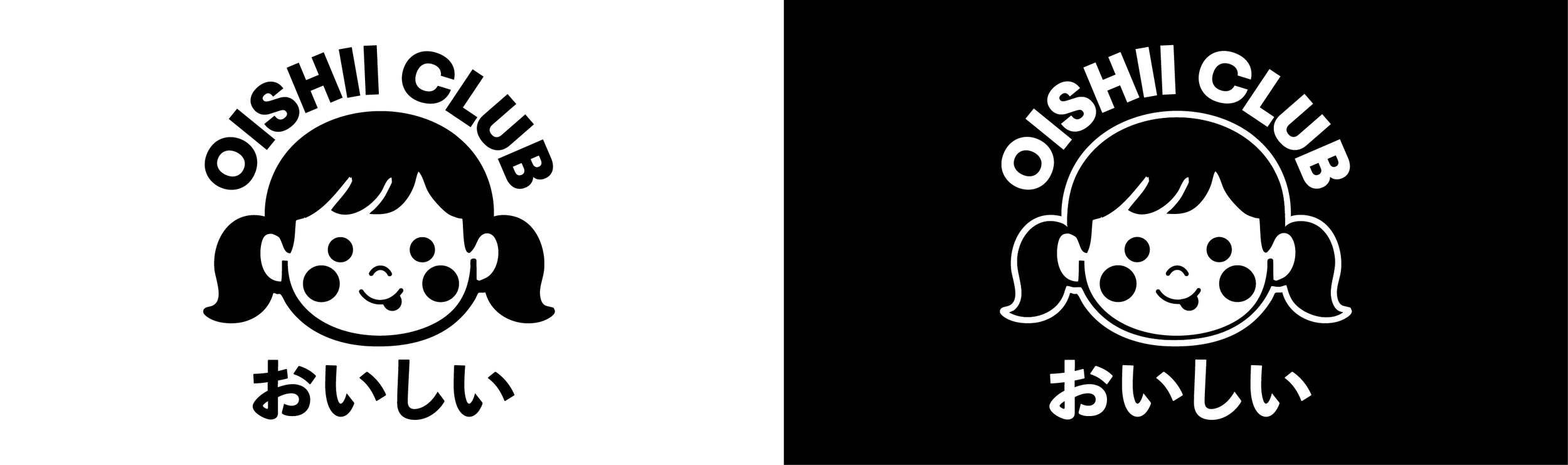
Oishii Club blends nostalgic Japanese pop culture with a playful ode to the kawaii aesthetic which is so present in today’s Japanese design culture. A wholesome cafe offering various Japanese dishes customers grew up eating gave way to the nostalgic quality of the cafe concept. To lean into the nostalgia the clients child photos were referenced for the brand mark. Because of the long-term design intentions a clean one color logo was designed to accommodate the more realistic style graphics to be used in the future.
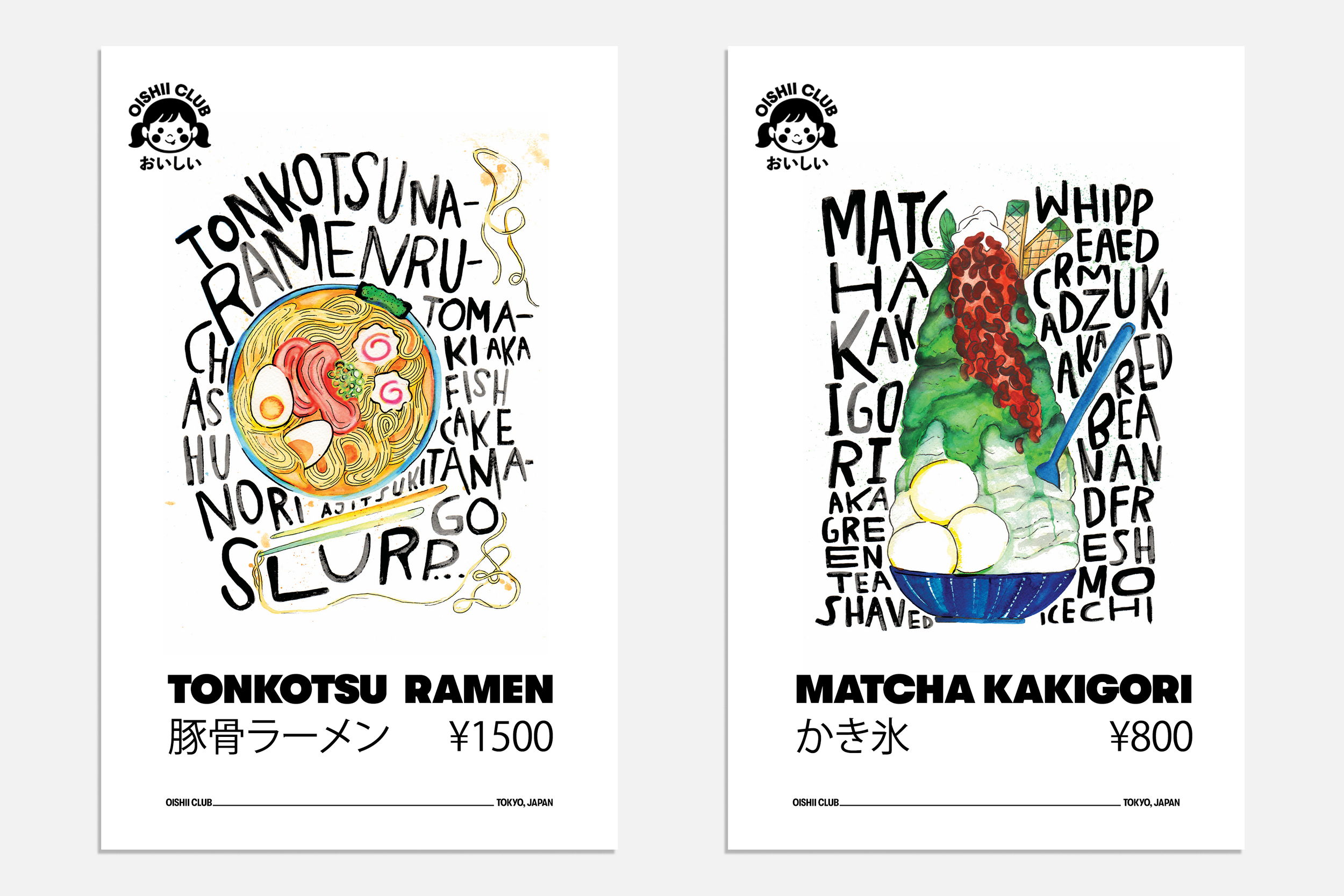
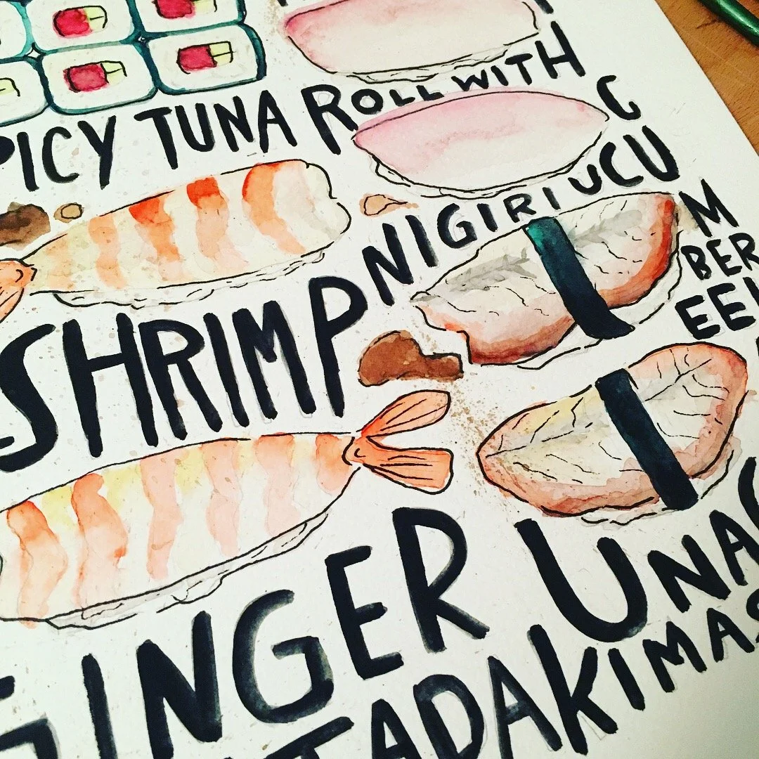
WATERCOLOR POSTCARDS AND POSTER
Oishii Club reimagines vintage signage for the modern era through watercolor realism. Each postcard and poster highlights one menu offering through hand painted watercolor illustrations — offering a fresh, beautiful alternative to the plastic food displays (sampuru) Japanese restaurants are famous for. In addition the clean black and white branding gives a platform to highlight the bold colorful illustrations without losing the modern clean aesthetic.