A modern women’s golf brand redefining on-course style through retro style and pop color palettes. Pirdie takes a fresh point of view on tradition bringing personality to performance while inviting more women into the sport. From their inception i’ve worked across apparel, headwear, packaging, and digital tools—supporting their vision with tactile, elevated design.
JUMP TO: APPAREL AND HEADWEAR | PRINT AND DIGITAL | PACKAGING
APPAREL AND HEADWEAR
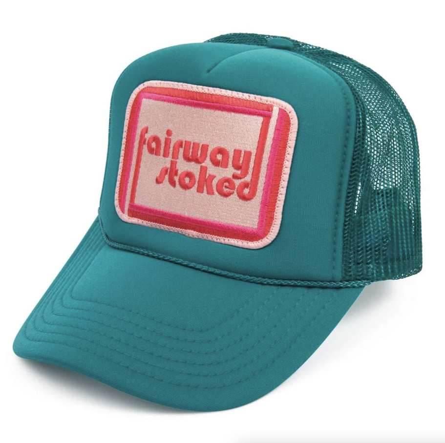
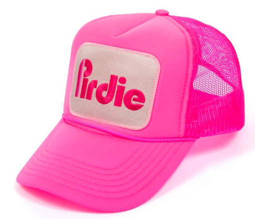
WOMENS GOLFING APPAREL AND HEADWEAR
Pirdie’s clothing taps into bold 1980s athletic nostalgia—bright piping, vintage graphics, and playful color blocking that recall vintage tennis kits and track sets. The collection balances function and flair, with breathable materials and confident silhouettes made for movement. Graphic elements take cues from retro logos and tournament merch, bringing an offbeat energy that sets Pirdie apart from traditional golfwear.


PACKAGING
CAMPAIGN TITLE
Pirdie’s packaging carries the brand’s retro flair through a seamless stripe motif that wraps around boxes and shipping bags with ease. Custom tissue paper, tape, and stickers echo the signature pink and beige palette—creating a cohesive unboxing experience that feels both nostalgic and elevated. Every detail reinforces Pirdie’s playful, design-forward identity from the moment it hits the doorstep.


Pirdie’s giveaway packaging includes a custom tee card featuring three pink tees slotted neatly into die-cut grooves. Designed to feel like a collectible, the insert pairs playful function with branded charm—an unexpected detail that extends the retro aesthetic beyond apparel and into every touchpoint. It’s a small gesture that leaves a lasting impression.


PRINT AND DIGITAL
SPLASH PAGE, BUSINESS CARDS, AND DISPLAYS
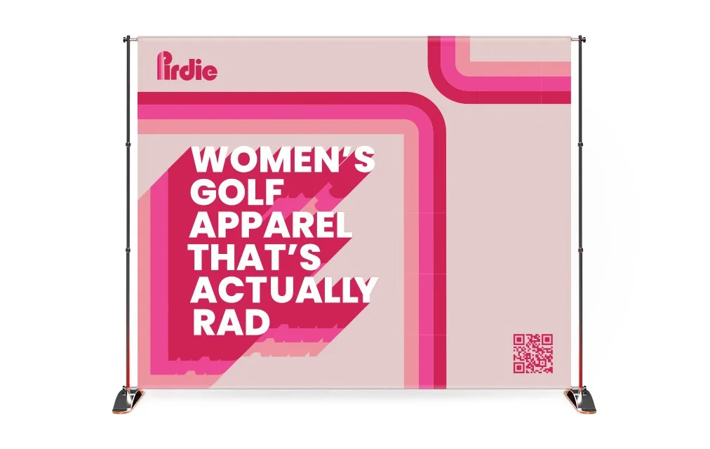
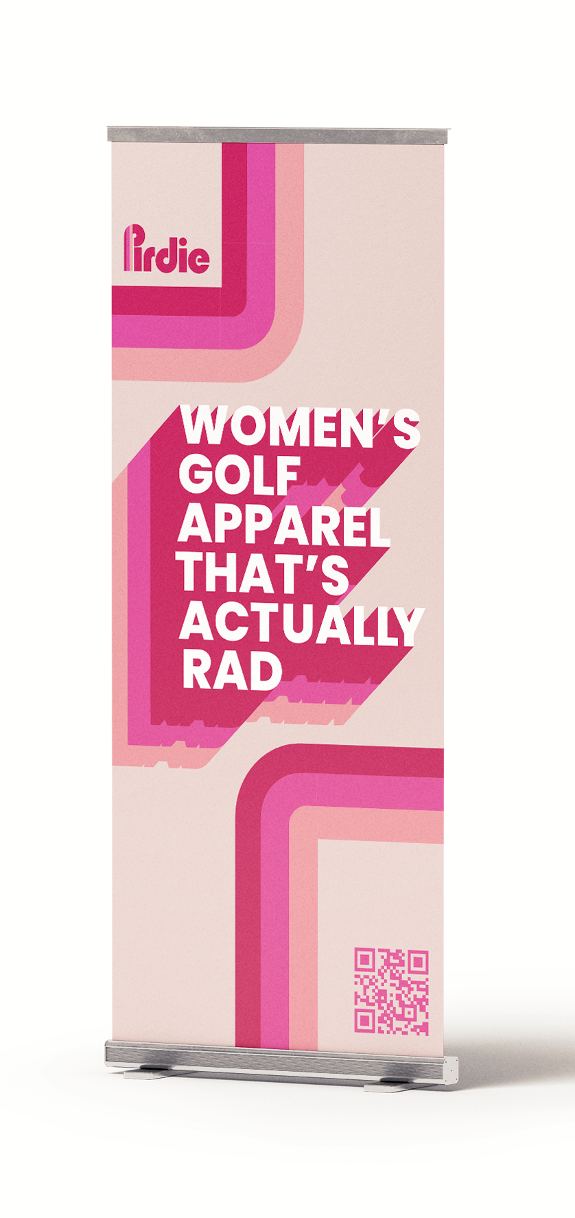
With no physical storefront, Pirdie’s presence at golfing events and wholesale tradeshows plays a key role in brand visibility. Custom backdrops, banners, and branded golf tees help create an immediate sense of identity—wrapped in the label’s signature pink palette and retro flair. Even the splash page mirrors this playful energy, offering a bold digital first impression that aligns seamlessly with the brand’s in-person presence. Together, these touchpoints turn heads and spark curiosity wherever Pirdie pops up.