PINEAPPLE WHIP POP PACKAGING
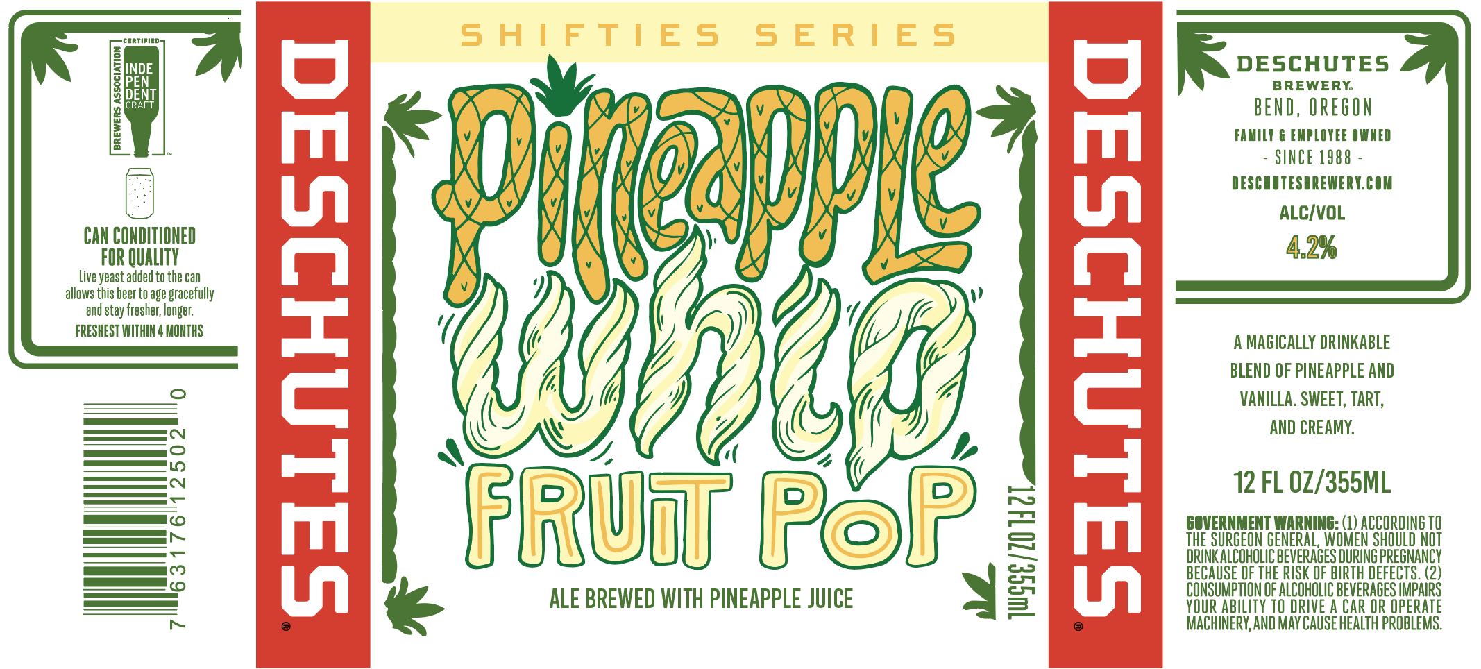
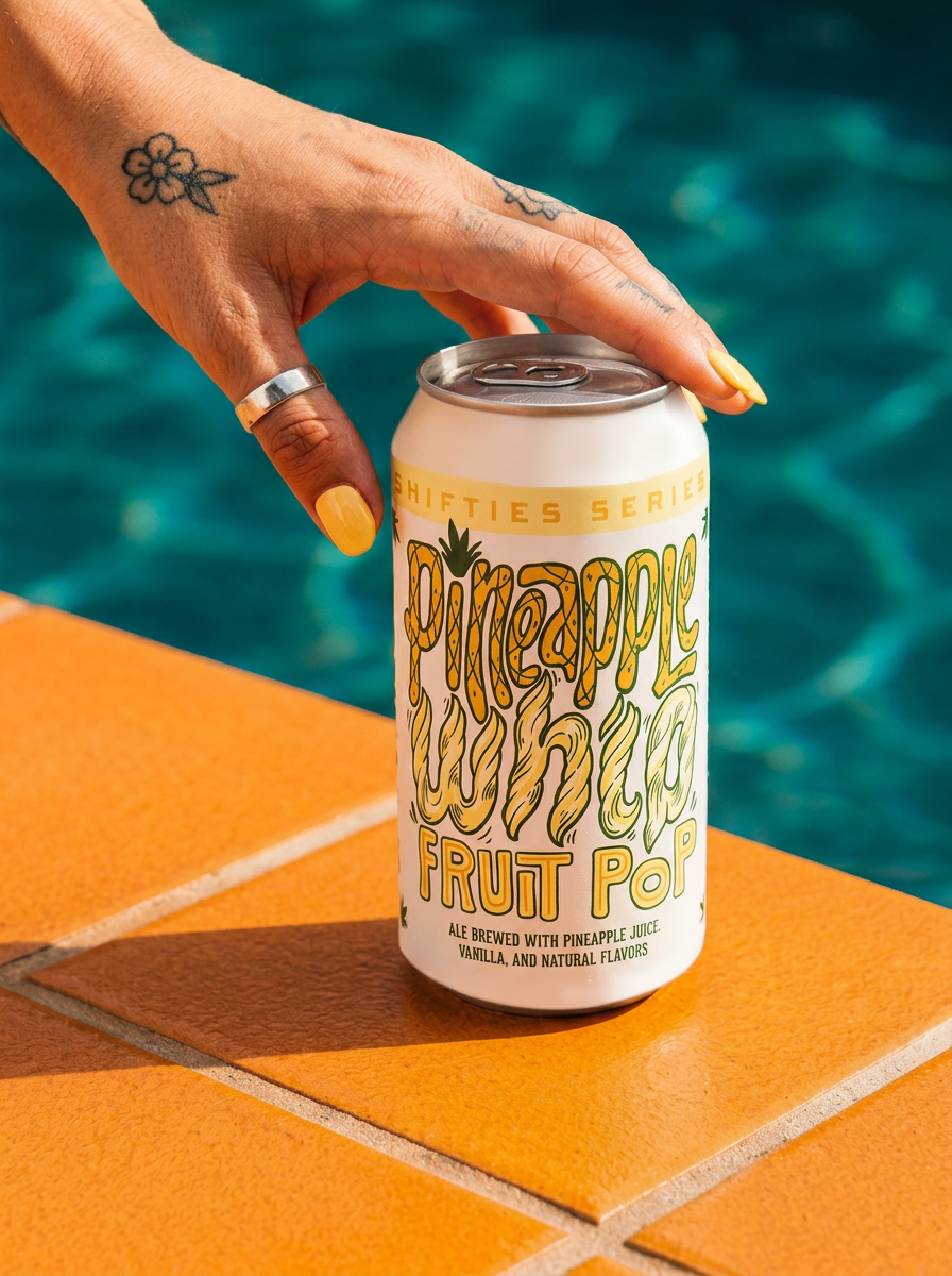
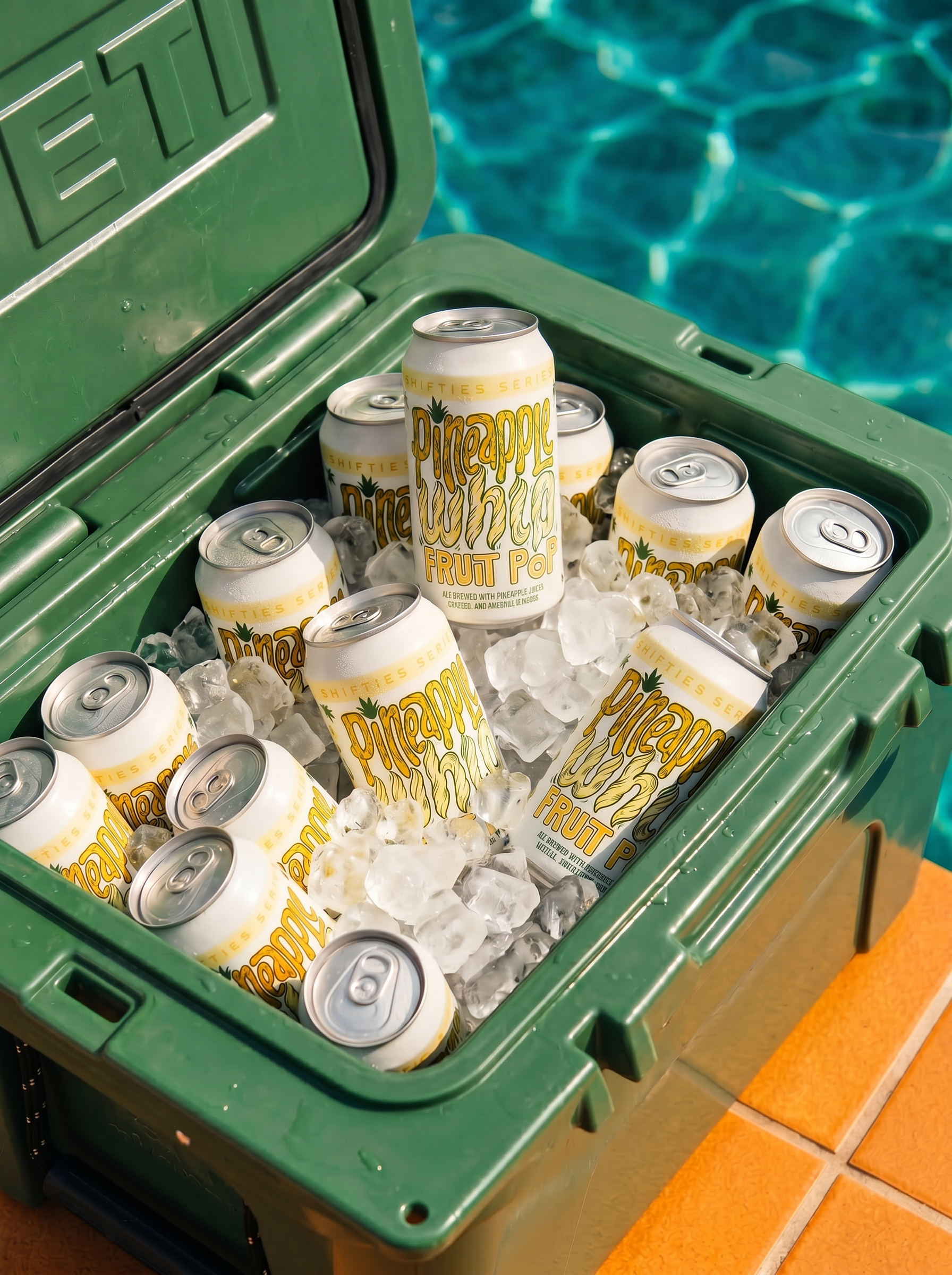
An ale brewed with pineapple juice and vanilla flavors, Pineapple Whip Fruit Pop called for a design as playful and nostalgic as its name. Leaning into an illustrative type approach, the label was inspired by the bold, cheerful energy of 1950’s advertisements—where hand-drawn typography and whimsical layouts invited consumers in.
The visual identity captures the bright, tropical notes of pineapple and the creamy sweetness of vanilla, balancing vintage charm with a modern craft beer sensibility. The design works to evoke both flavor and feeling, creating a packaging experience that’s as fun and inviting as the ale itself.
CONCEPT EXPLORATION EXAMPLES:

CATHARINA GUAVA SOUR
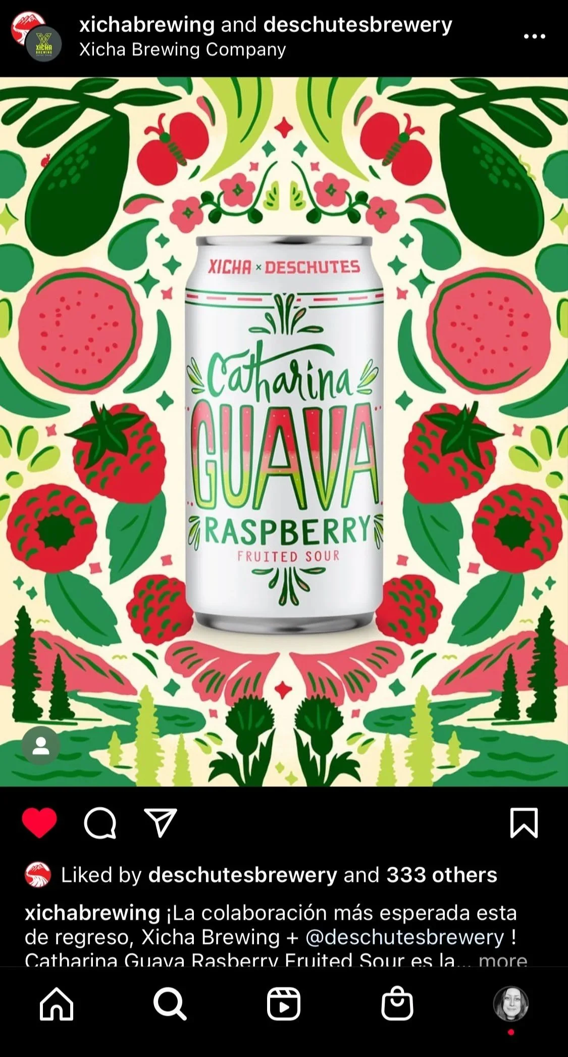
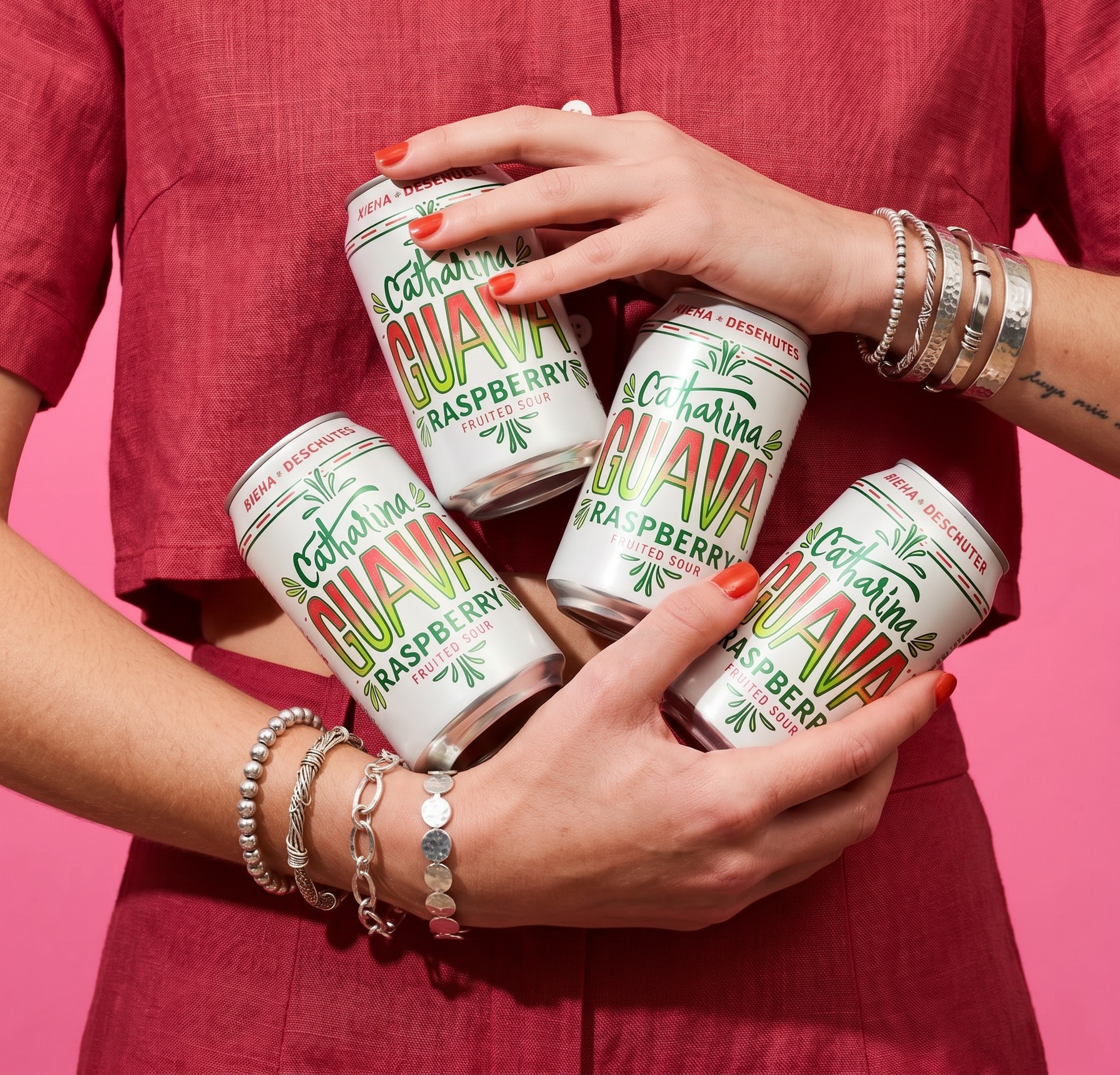
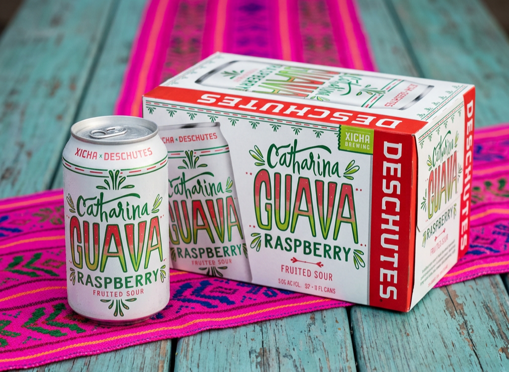
The Xicha x Deschutes collaboration highlights the vibrant aromas of guava and sweet tropical flavors. The design centers on a dynamic typographic exploration, combining three distinct hand-rendered typefaces that bring varied styles and energy to the label. A pop of guava-inspired colors adds brightness and ties the visual identity closely to the fruit-forward character of the sour ale.
This project showcases a playful yet sophisticated approach to typography and color, creating a label that stands out on shelf while embodying the tropical essence of the brew.
CONCEPT EXPLORATION EXAMPLES: