

What started as an in-house contract in May 2022 grew into a 20 month retainer and ongoing freelance relationship. The work below is a selection of higher level projects, though the full scope of work includes dozens of smaller projects: consumer facing projects spanning various smaller campaigns, OOH, illustrations, Creamery environmental signage, guideline and presentation decks and various internal client projects.
JUMP TO: BRAND CAMPAIGNS | BRAND IDENTITY | PHYSICAL SPACES | MERCH | APPAREL | SOCKS
BLOCK JAMS CAMPAIGN
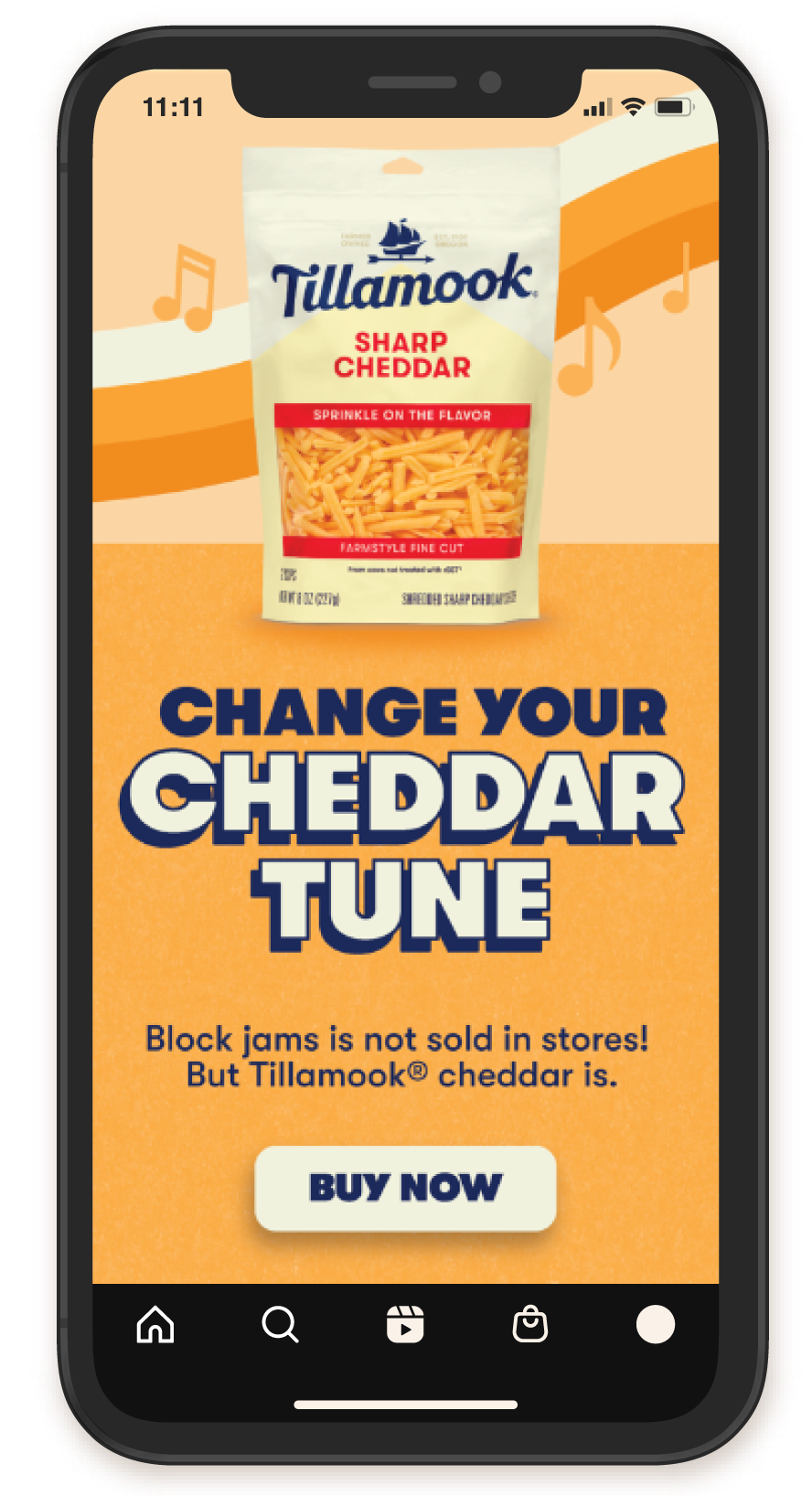
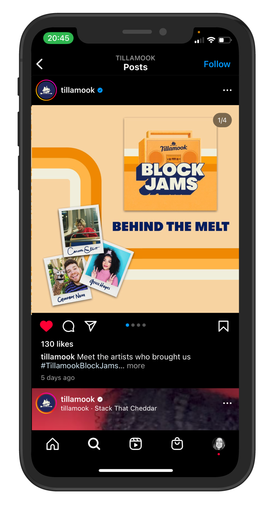
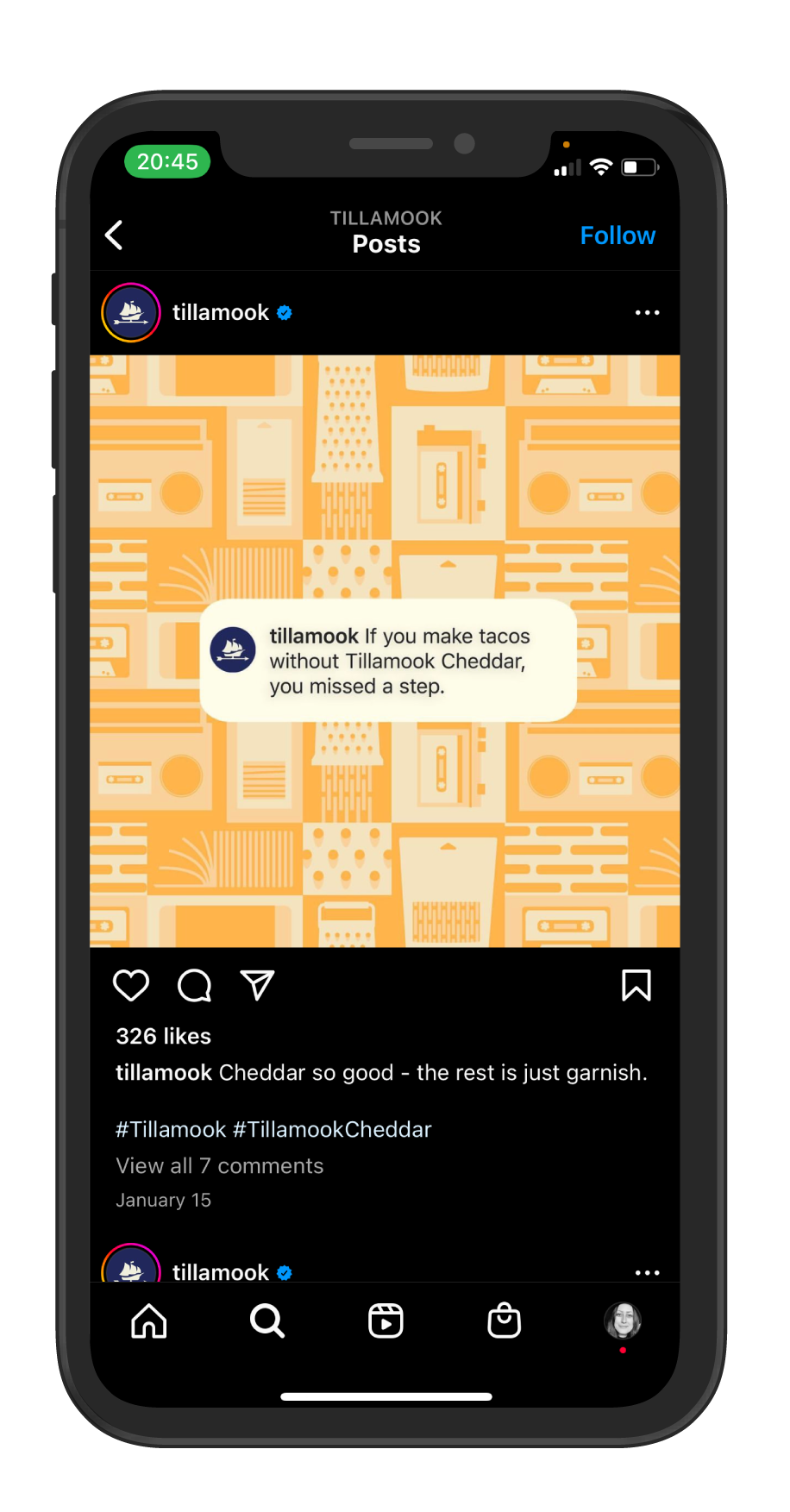
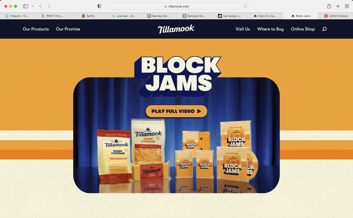
Briefed on a 90s mixtape theme, I redirected the creative direction into an 80s pop culture world, recognizing the mixtape and boombox as the icons of that decade. A cheddar boombox campaign drawn from the era's hip hop and boombox culture, the rainbow striping of the Reading Rainbow logo, classic van pin striping paint detail, and VHS packaging. The conceptual core came from using the product itself as the visual language, the mother loaf became a boombox, a cheese photo became a cassette tape, turning Tillamook's signature product into the storytelling device that drove the entire campaign. From that concept I designed the complete asset suite including the logo, OOH layouts, and pattern system that became the visual center, delivered in two days from initial brief.
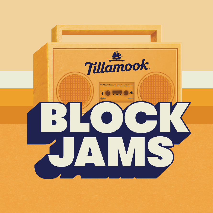
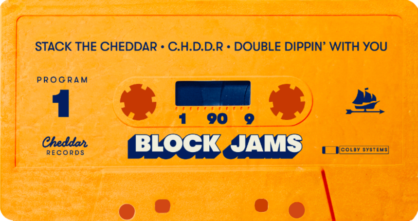


The Tillamook Block Jams visual direction carried through the commercial, summer pop-up events, and all physical applications I designed including the T-shirt, PR box, mini mic cheddar block, and boombox cooler, with execution by Portland Garment Factory.
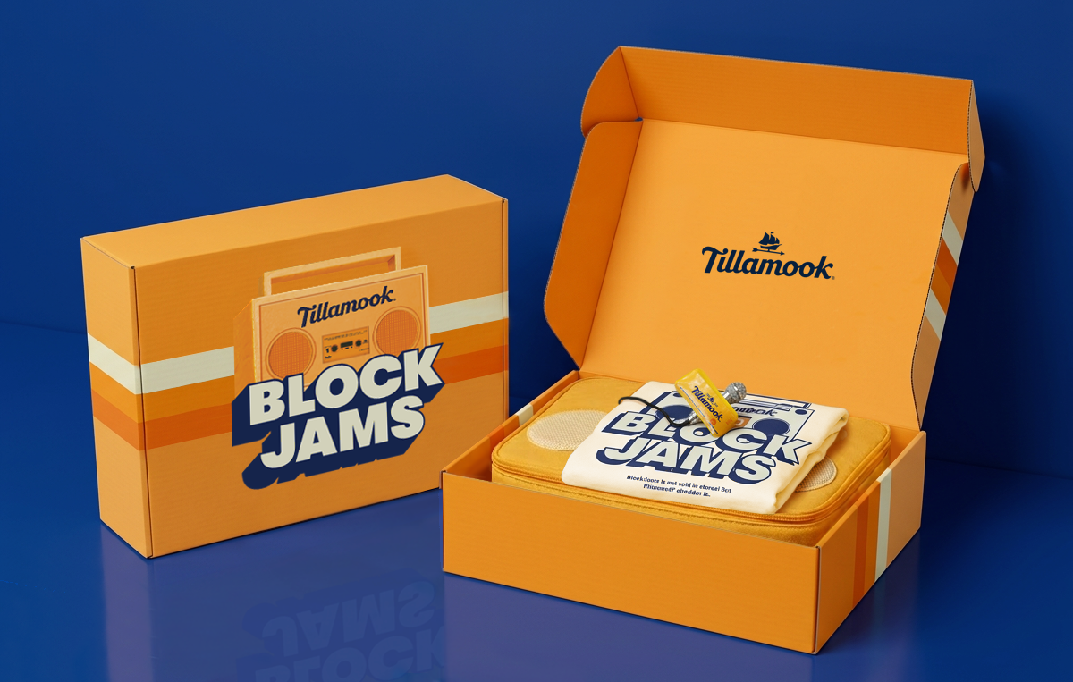
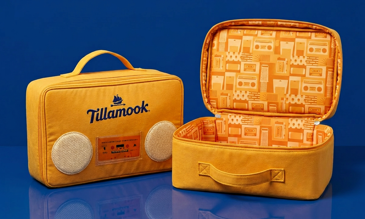
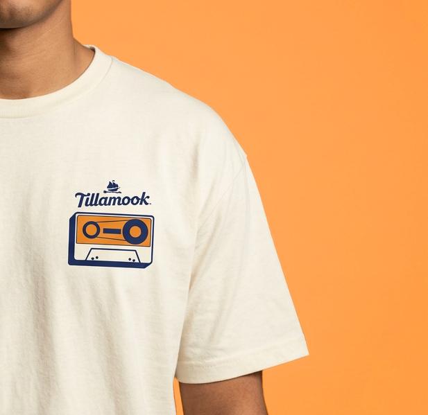
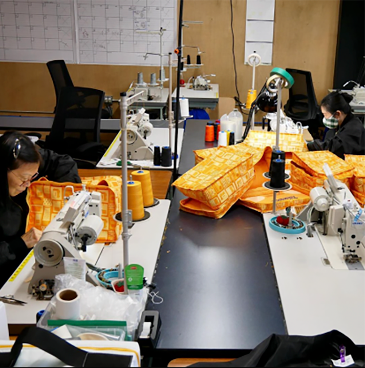
Photo credit: PFG
NYC HUDSON YARDS POP-UP
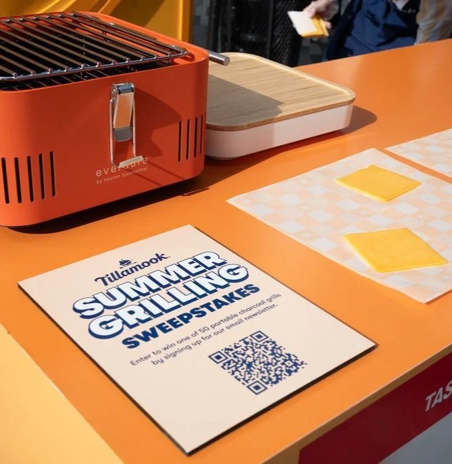
In partnership with Happy Lucky, the second phase of the Block Jams summer campaign was a NYC Hudson Yards pop-up. Tying back to the visual center I initially created, I was brought in as the brand expert to lead all graphic design for the activation ensuring full visual consistency with the campaign's established language. This included art directing all color decisions for the physical builds, which were rooted in the original campaign design. Deliverables included menu board, sample serving paper repeat patterns, burger flipping platform, uniforms, game entry stand, and marketing ads; all designed, spec'd, and delivered in under one week, in partnership with project manager Amalya Haver and final approvals by Art Manager Jon Hsu.
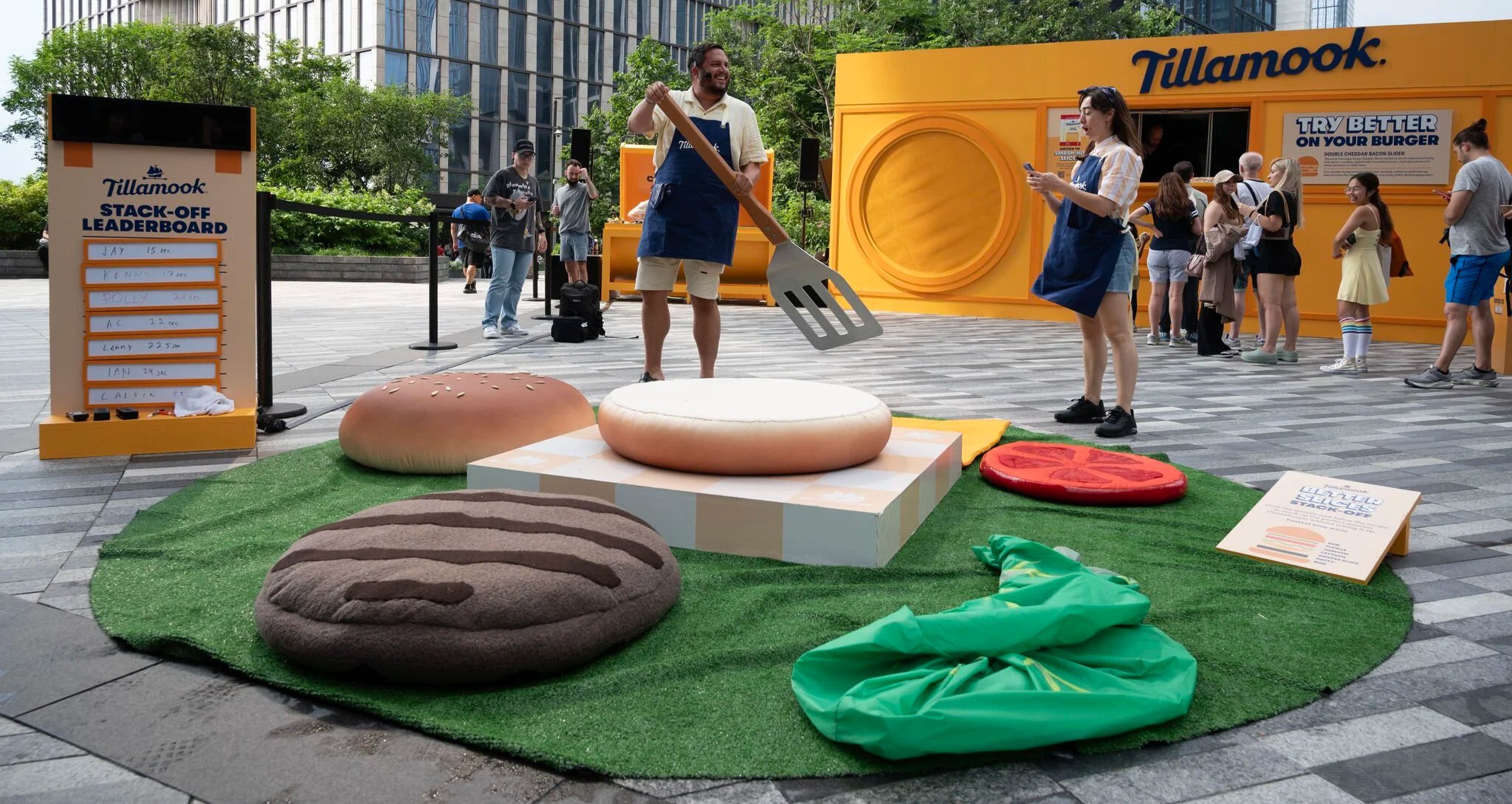
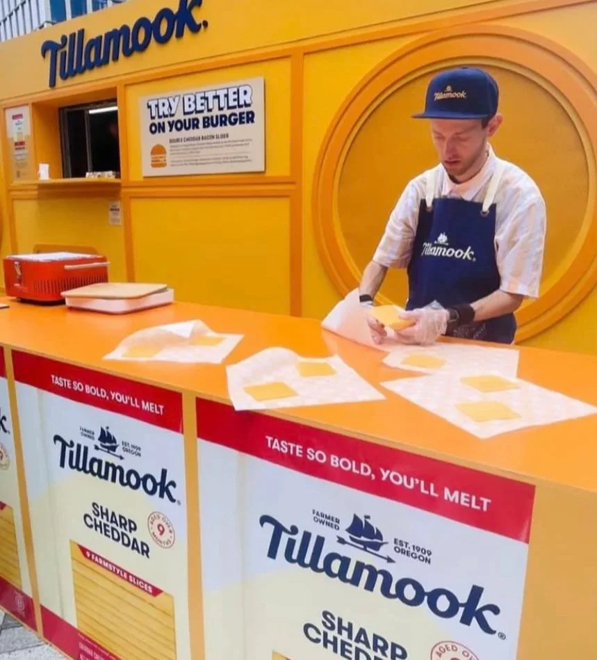
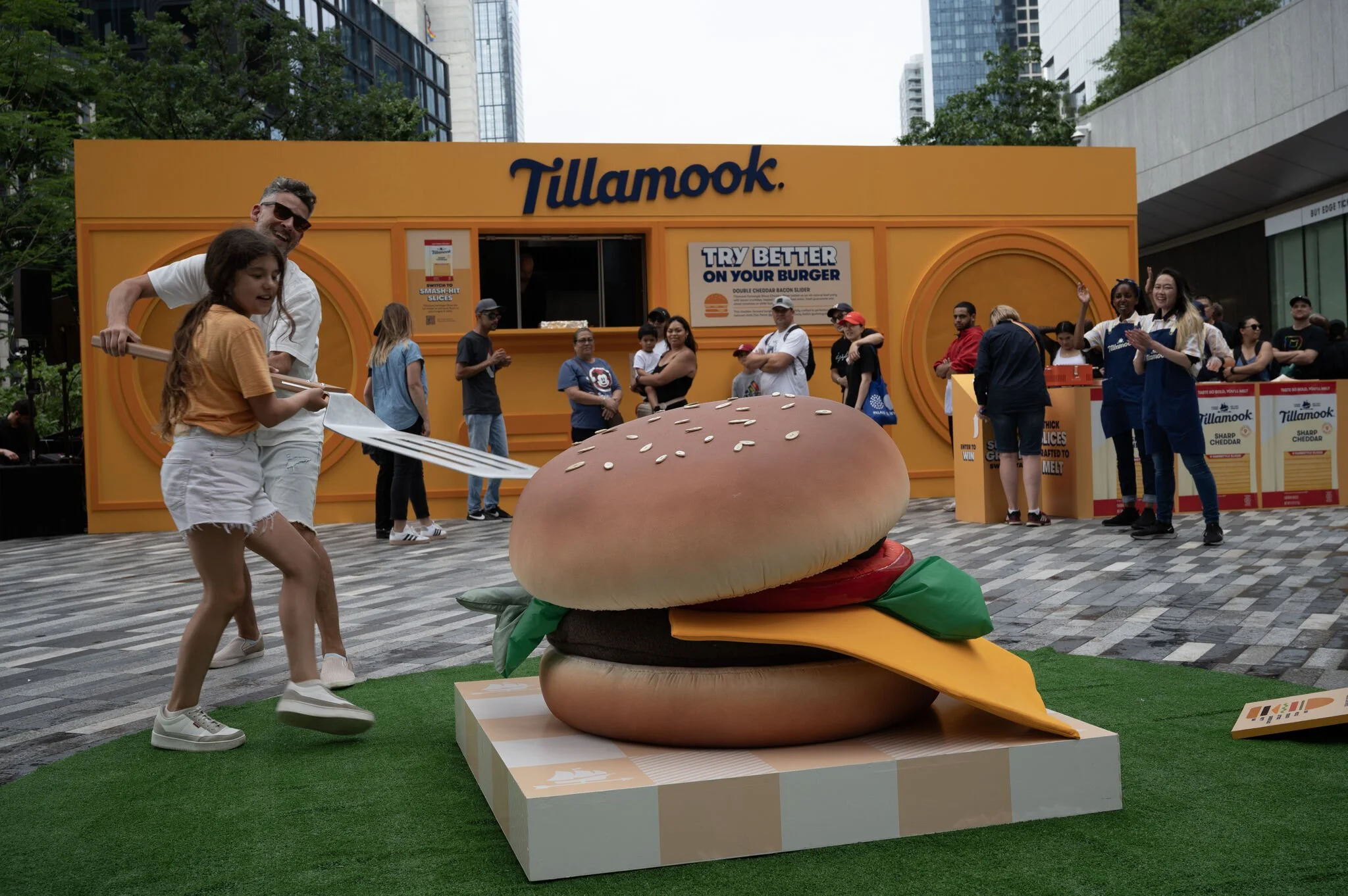
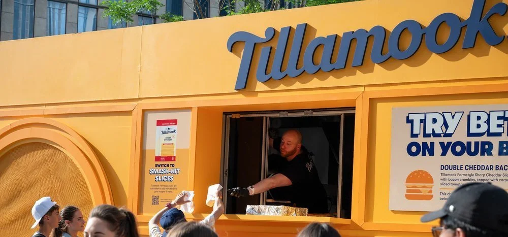


Staff uniforms were curated within a three-day sourcing window, pulling from existing Creamery inventory and Old Navy to maintain brand cohesion under tight production timelines while staying within the visual center campaign guidelines.


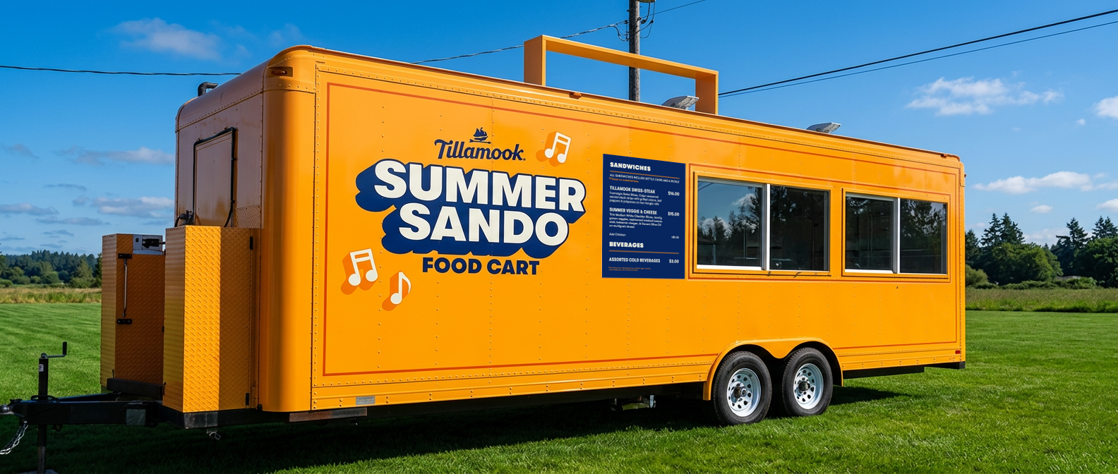
BLOCK JAMS CREAMERY FOOD TRUCK
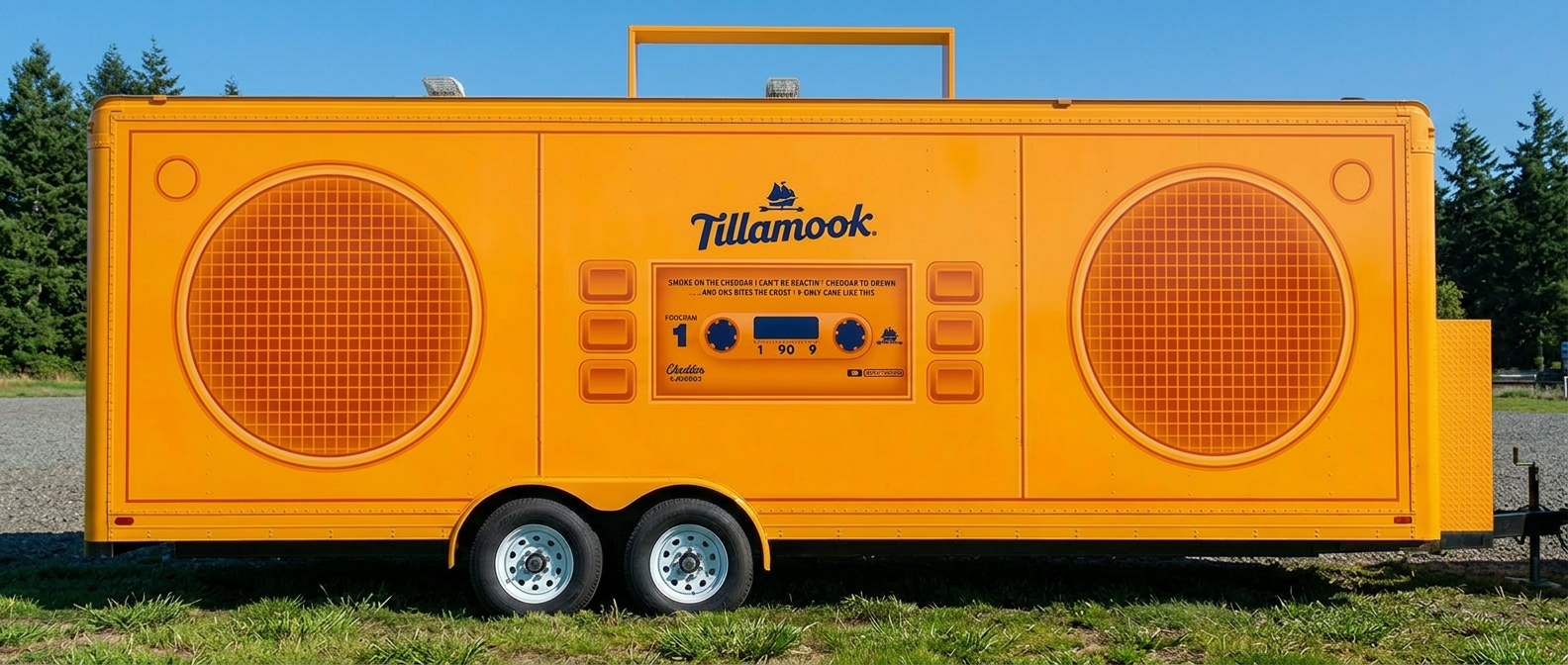
The third phase of the Block Jams campaign brought the visual center to the Oregon Coast through a full Tillamook Creamery food truck activation. I adapted the Block Jams logo and visual language into a full trailer wrap, with one side of the truck designed as a boombox — a direct translation of the original visual center into physical form at scale. The food menu was printed on Sintra panel to mimic the existing Creamery signage format, maintaining brand cohesion within the coastal location's established aesthetic. I also engineered the specs for the oversized boombox handle, developing a weighted mounting solution to avoid drilling into the trailer. All production was executed in direct collaboration with Don at PVS Graphics, my local fabrication vendor. Final approvals by Creative Director Audrey Crespo.
CREAM CHEESE TAKEOVER CAMPAIGN
Tillamook partnered with four bagel shops nationwide, covering the cost of any bagel ordered featuring the new Cream Cheese flavors. Briefed by Creative Strategy Director Bridget Zadoff, I was tasked with developing the visual center and campaign concept around the copy headline "We Got You Covered." Taking the headline literally became the core concept for the creative direction. I developed a visual world built around the act of covering. Giant cream cheese schmears blanketing entire establishments, oversized cream cheese containers anchored the spaces, coverall uniforms dressed the staff, and branded bagel bags literally covered the product. Concept development, graphic layouts, and full design were completed in two days and handed off for production to Liz Wolcott. Final approvals by Art Manager Jon Hsu.


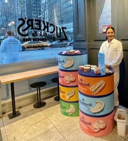

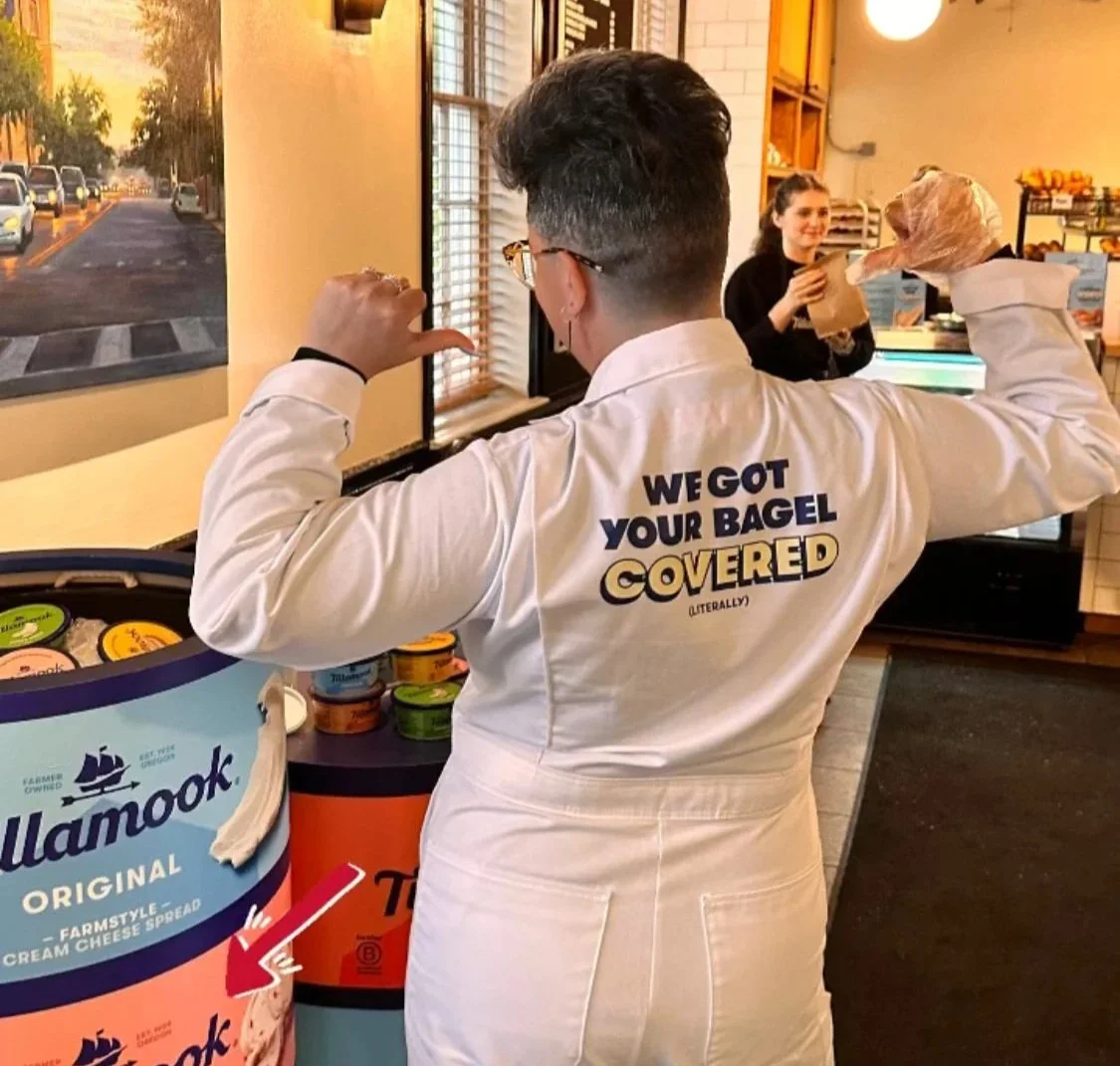
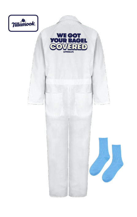
Given the two-day turnaround, uniforms needed to be sourced and assembled quickly without sacrificing brand cohesion. Drawing from an existing Tillamook brand reference, the white lab outfits worn by factory scientists complete with Tillamook patches sold in the factory's own retail space, we sourced white jumpsuits, screen printed the backs with the campaign copy, and applied the patches, positioning brand ambassadors as experts within the Tillamook universe. Pop color socks in the campaign's bright blue completed the look.
PARTNERSHIP FOR CREAMIER ICE CREAM CAMPAIGN
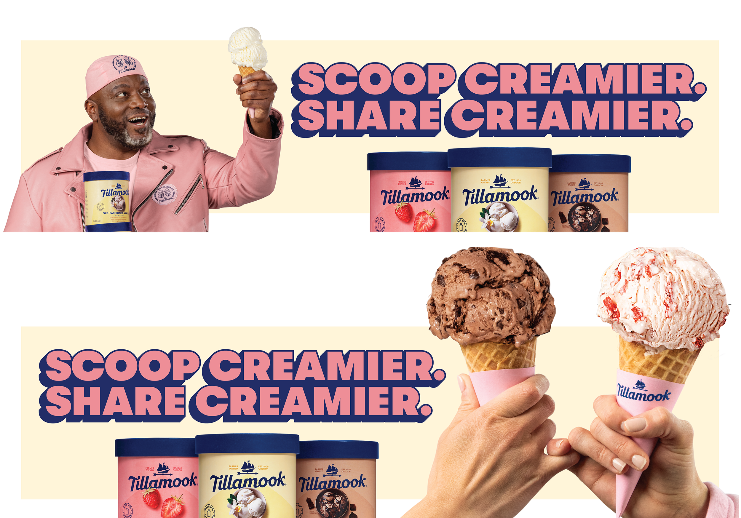
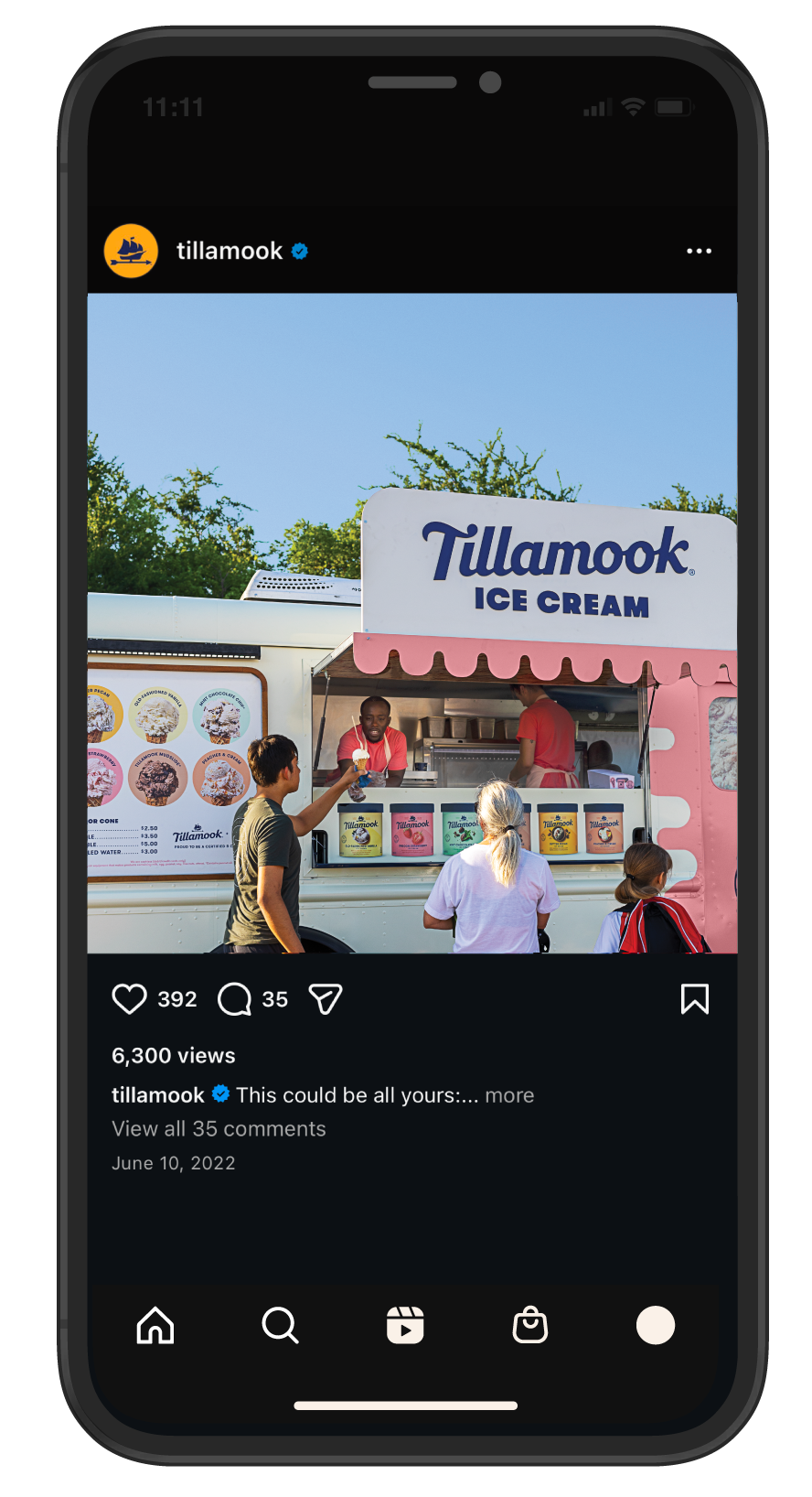
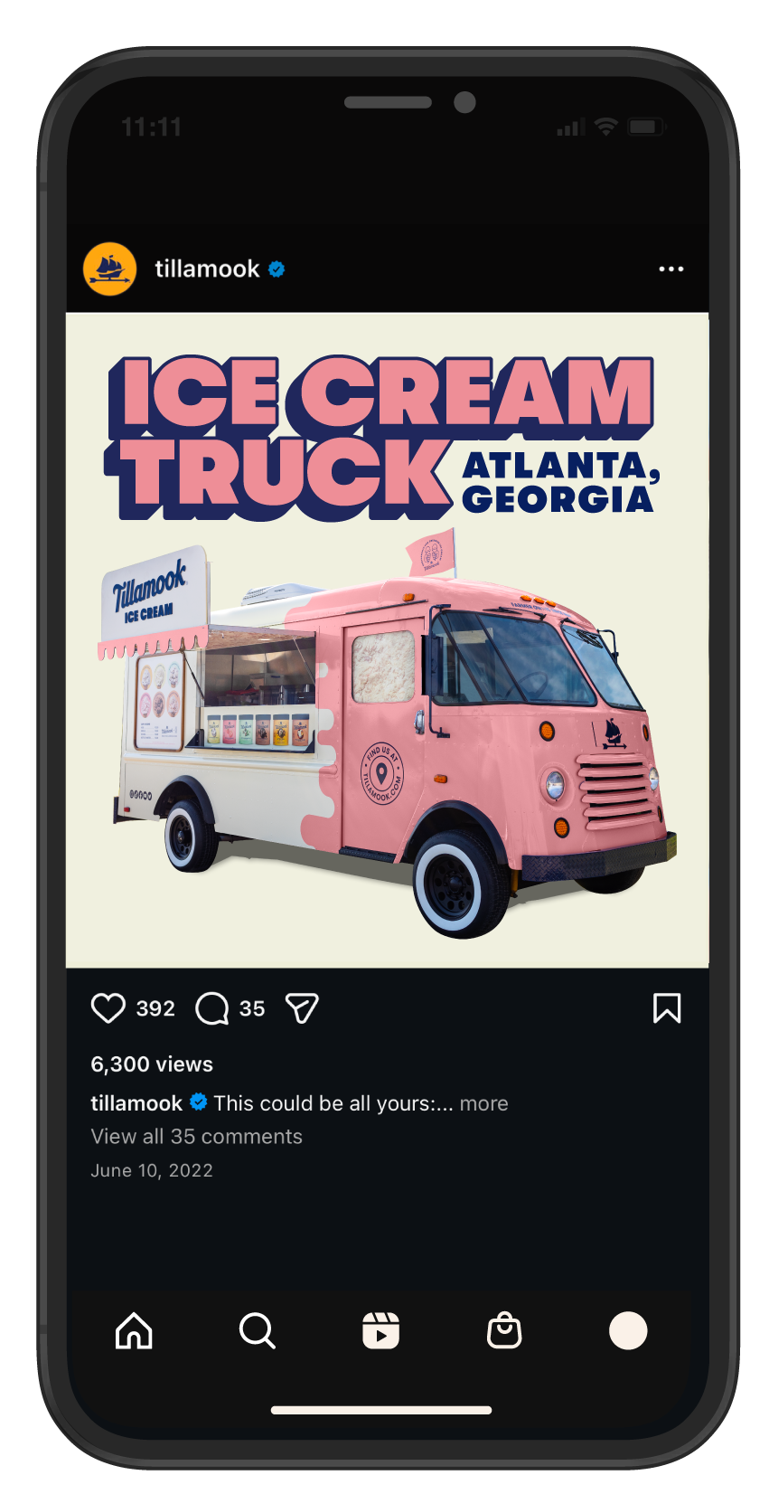
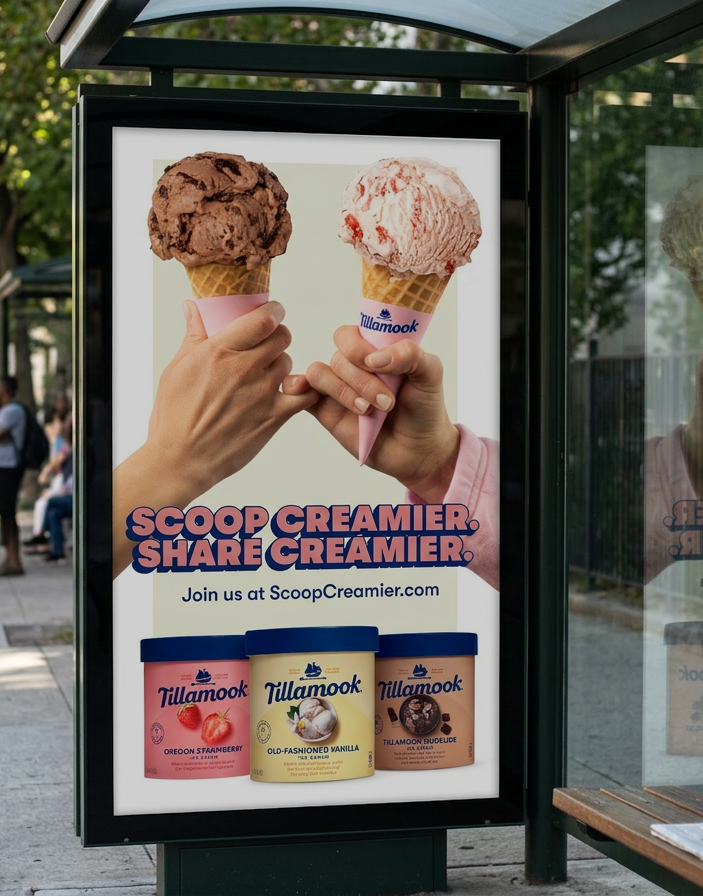
Managing all OOH layouts for the PCIC campaign , I executed over 40 placements spanning static, digital, and cutout billboard formats, targeted social media ads, motion graphics, and general ad placement for the Tillamook Creamery location, following a visual center established by an outside agency.



HOLIDAY
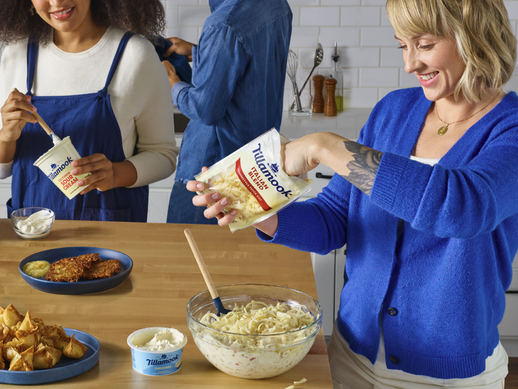
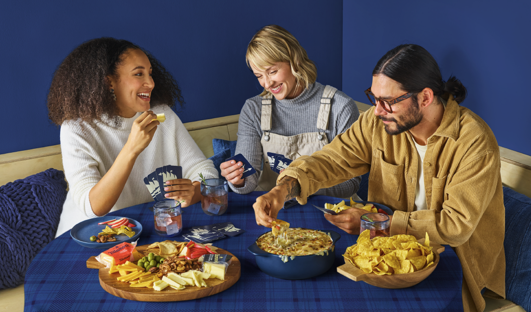
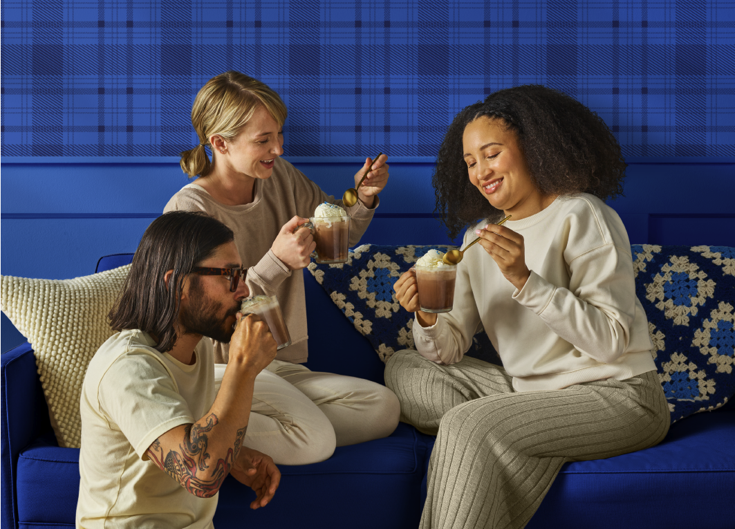
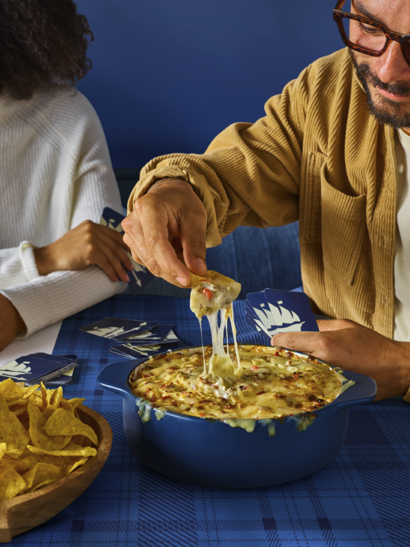
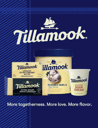
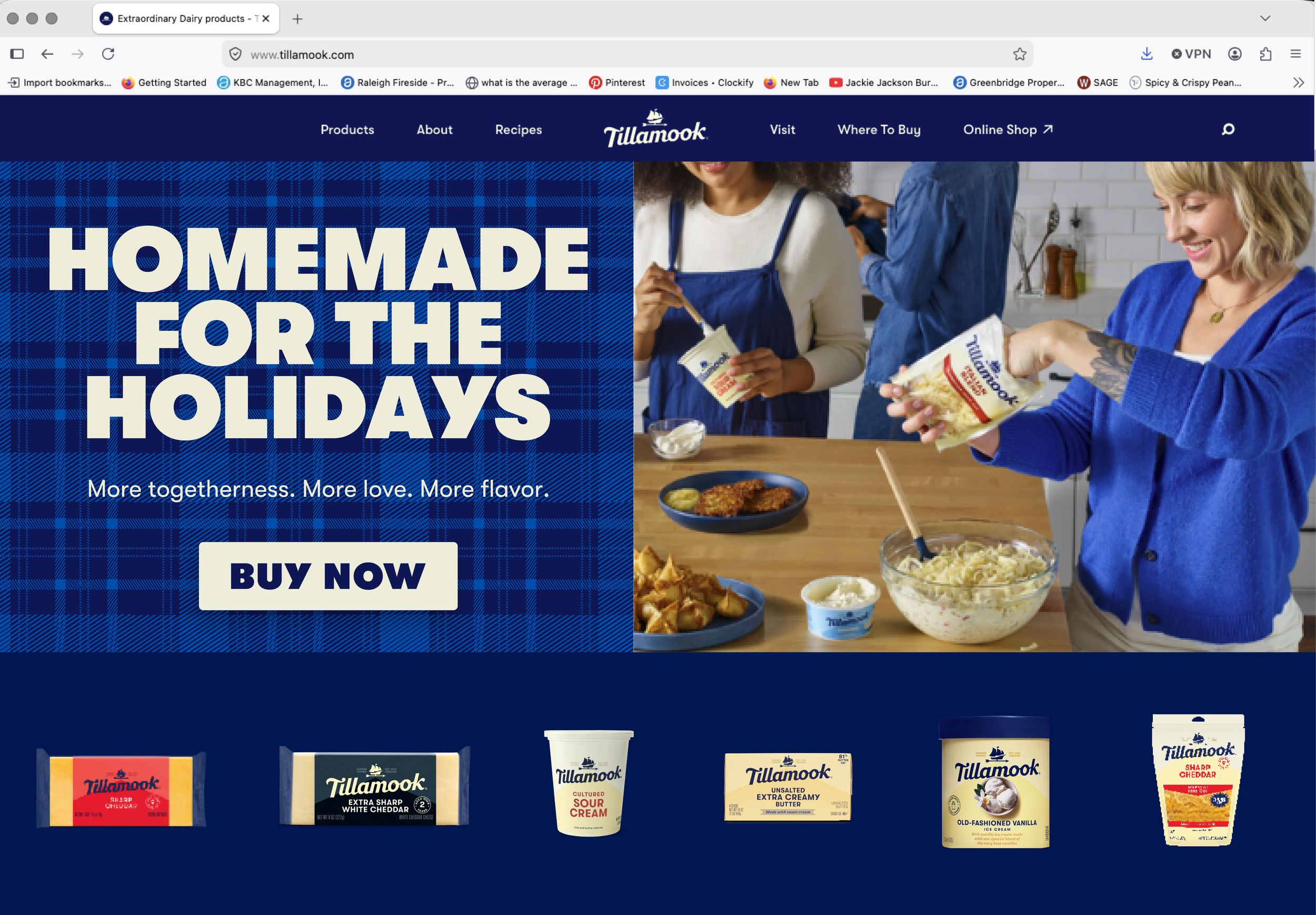
Working within a limited budget, I developed the full visual center for Tillamook’s Holiday campaign, building a cozy plaid inspired color story rooted in the existing brand palette that could flex across both winter and holiday touchpoints without leaning too seasonal. I built a comprehensive visual center deck and shot list that covered every detail of the production including outfit selection, prop sourcing, model casting, set direction, shot layouts, and graphic applications across OOH and digital shopper ads. Working directly with the photo producer and photographer on set, I shaped each shot to align with the visual center, co-directing alongside fellow contractor Allison Bagnell to bring the imagery to life. Final approvals by Creative Director Audrey Crespo.



BRAND IDENTITY
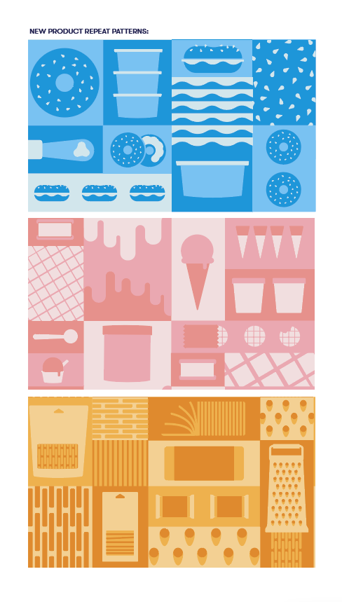
2023: Briefed by Creative Director Audrey Crespo with a two-day turnaround, I developed the foundational visual language for Tillamook's 2023 brand refresh. The core of the system was a product-driven color language, assigning a distinct color world to each product category to be used consistently across print, digital, and social. I established the overall layout formatting, typography application, and geometric styling that modernized and streamlined the brand's previous approach. As an extension of the refresh, I designed new repeat patterns for each product category, rooting the graphic signature in a contemporary geometric language.


To launch the new visual language, I developed the shot deck for the brand's first photoshoot under the refresh. This included layout direction, prop and surface styling, and color palette application, establishing the split color, product-driven monochromatic world seen across the resulting imagery. The visual center/ shot deck was then executed by Creative Director Audrey Crespo and Art Manager Jon Hsu.
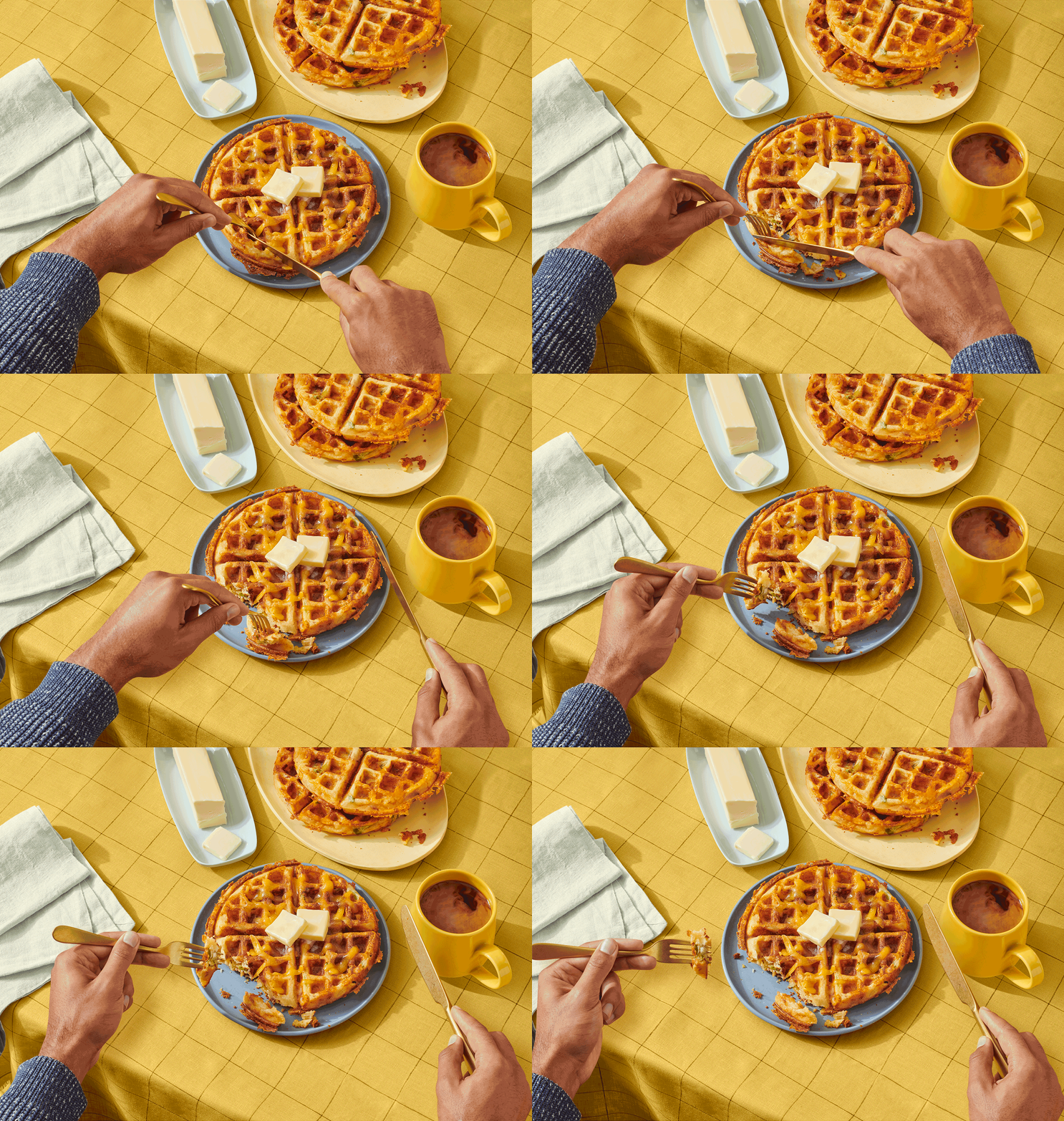
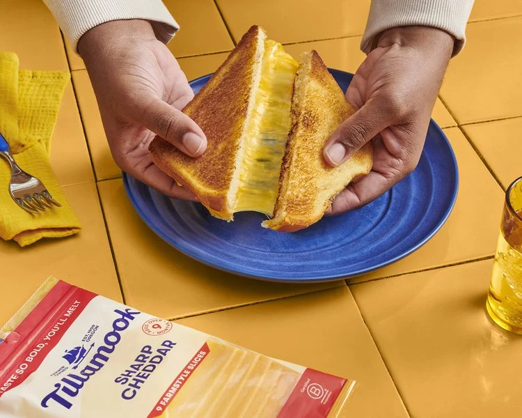
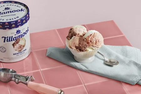


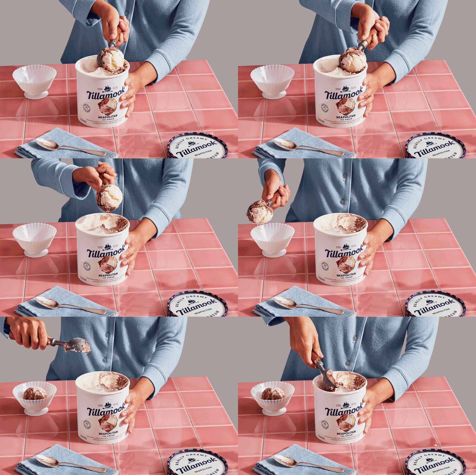
Photos by Julia Stotz
2024: The visual language was expanded on in partnership with a new brand agency. I developed the VC guidelines, shopper layouts, and extended repeat pattern system to carry the collective direction forward. Final approvals by Creative Director Audrey Crespo.
TILLAMOOK X TIMBERS SCORE BOARD
What began as a standard sponsorship graphic was reimagined under my art direction into a dynamic, game-integrated brand moment. For each Portland Timbers goal, fans are signaled by a banner drop, with each Tillamook flavor representing a specific score. I storyboarded and directed seven digital flags, creating a game-appropriate brand expression that plays across an 18 foot wide by 42 foot tall LED video wall at Providence Park. The concept was inspired by the dramatic flag drops of Quidditch, reimagined for a high energy real time sports environment. Final approvals by Creative Director Audrey Crespo.




OFFICE REFRESH
Spanning three locations across the Portland Outpost, Corporate Office, and Boardman Processing Facility, I led the Tillamook Office Refresh from concept through final installation. Responsibilities included concept development, presentations, design, specs, and on site oversight across 9 visits over 15 months. The work encompassed 5 murals, 60 large scale photos, 29 art pieces, 10 large scale brand signs, 20 wayfinding signs, and over 300 ADA signs, all unified through brand colors, Tillamook’s geometric illustration style, and a consistent visual language. The centerpiece was an original mural depicting the full journey of Tillamook cheese. Project management, timelines, budget, and vendor coordination were handled by Project Manager Abbie Nelson. Final approvals by Creative Director Audrey Crespo.


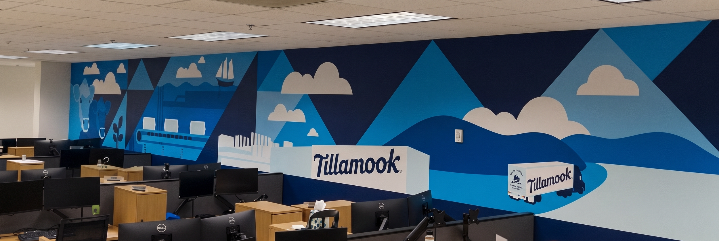
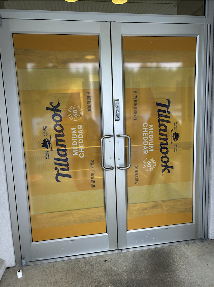

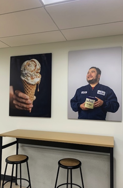
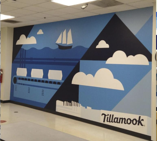
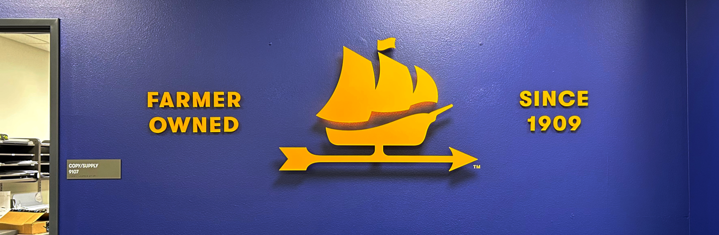


As part of the office refresh the Tillamook Fleet of Delivery Trucks were refreshed from red tractors to newly painted blue tractors and new door graphics. I provided the auto body shop with the automotive paint brand/ chip and new graphics for the doors.


MERCH
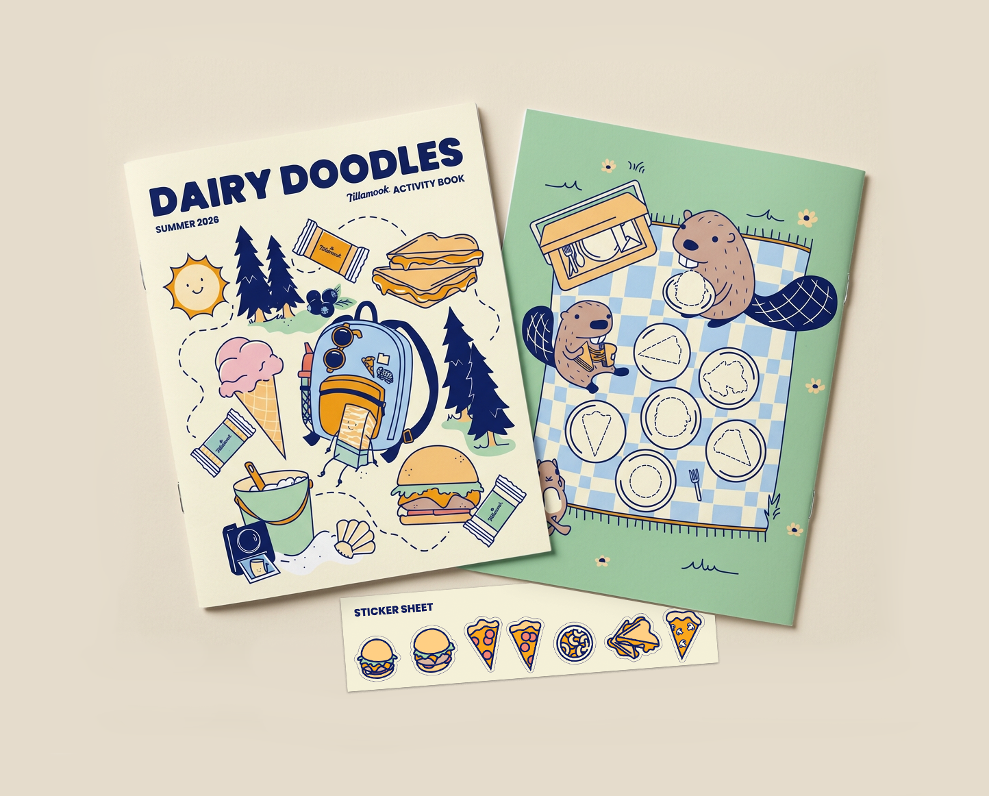
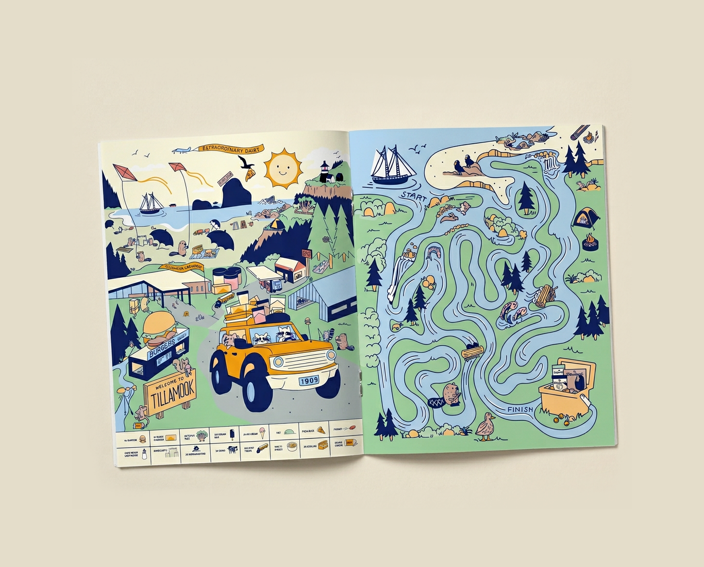
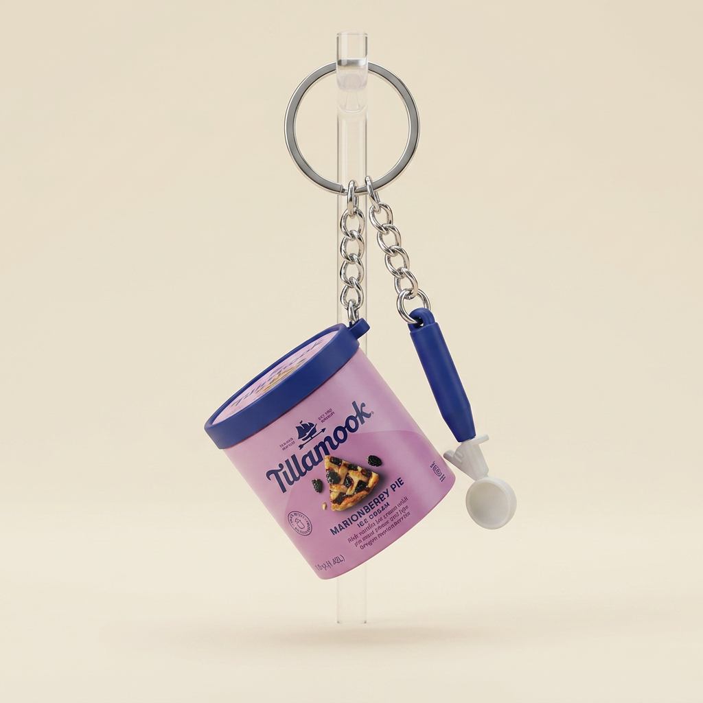
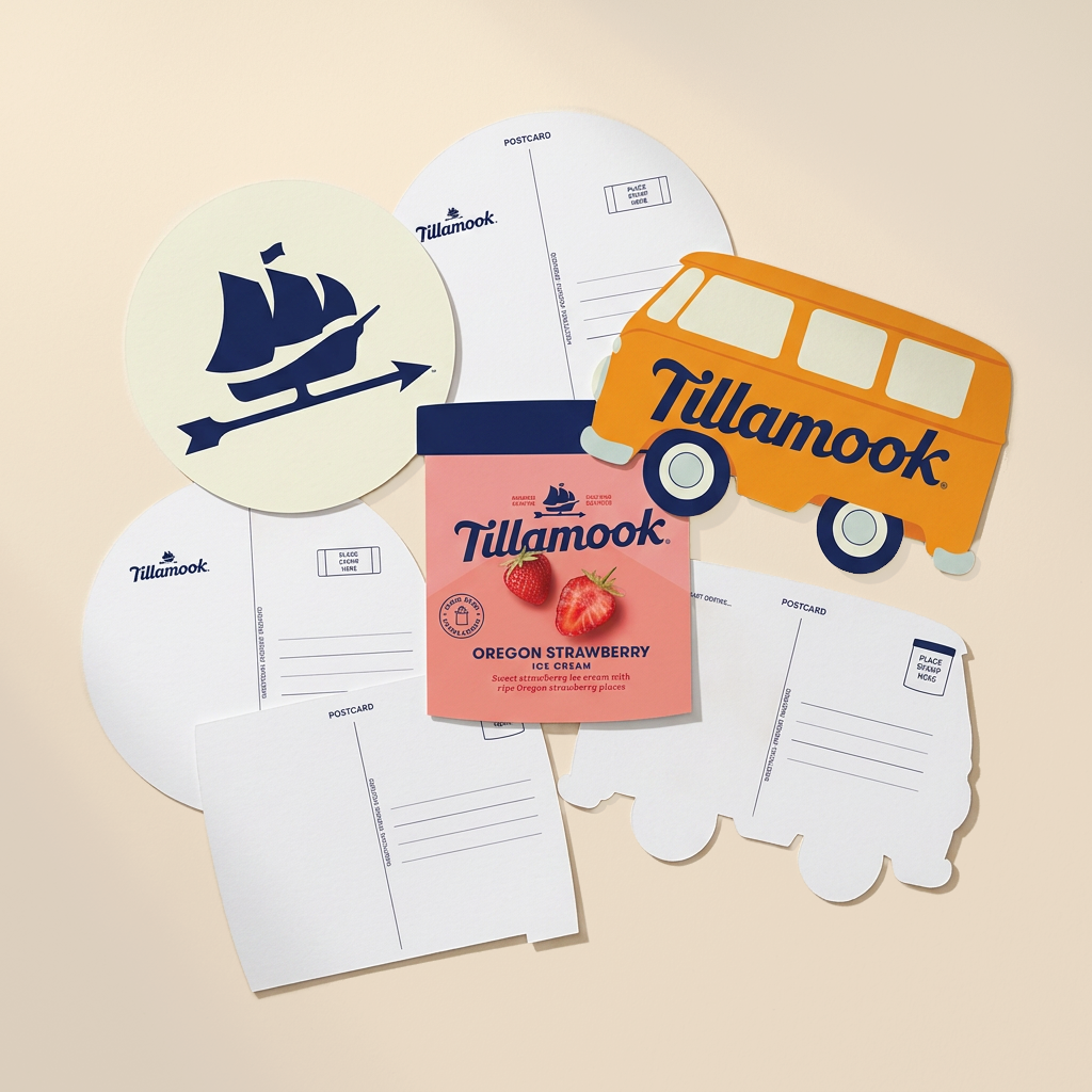
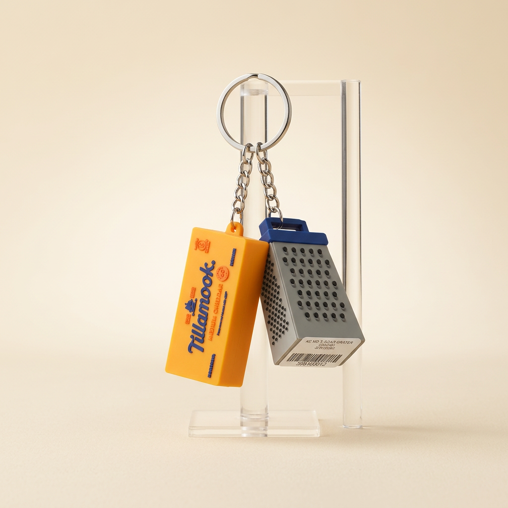
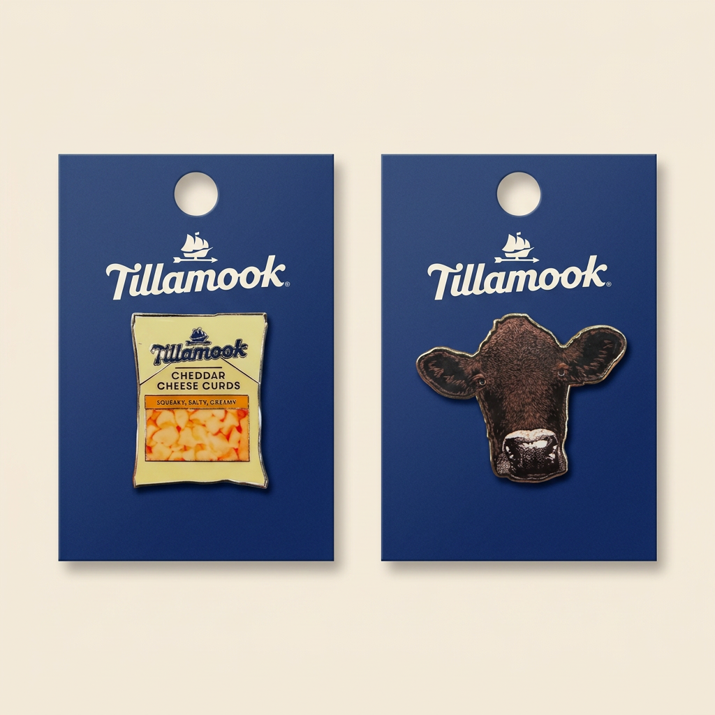
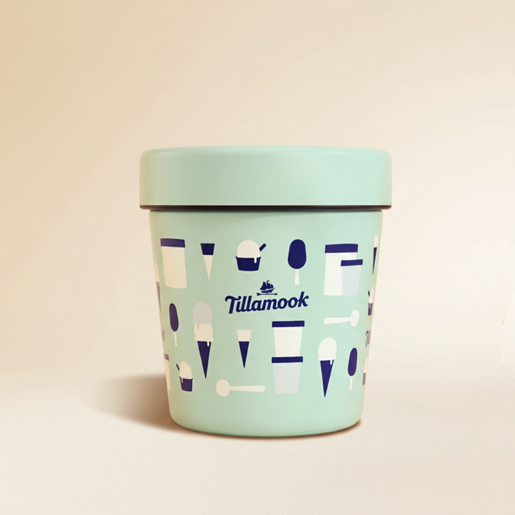
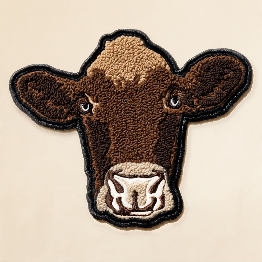
Over four years of merch design for the Tillamook Creamery, in collaboration with Gifts and Food Buyer Jessie Li, I developed a line of on brand specialty products that required a deep understanding of the Tillamook brand and could not be broadly outsourced. The program includes 3D silicone injection mold keychains of the most popular ice cream flavors and cheese, for which I created the full 3D production schematics, alongside enamel pins, patches, stickers, post cards, insulated pint containers, sunglasses, bags, headwear, and a multi page illustrated children’s activity book. Apparel and socks are part of the broader program and detailed further below.
SOCKS
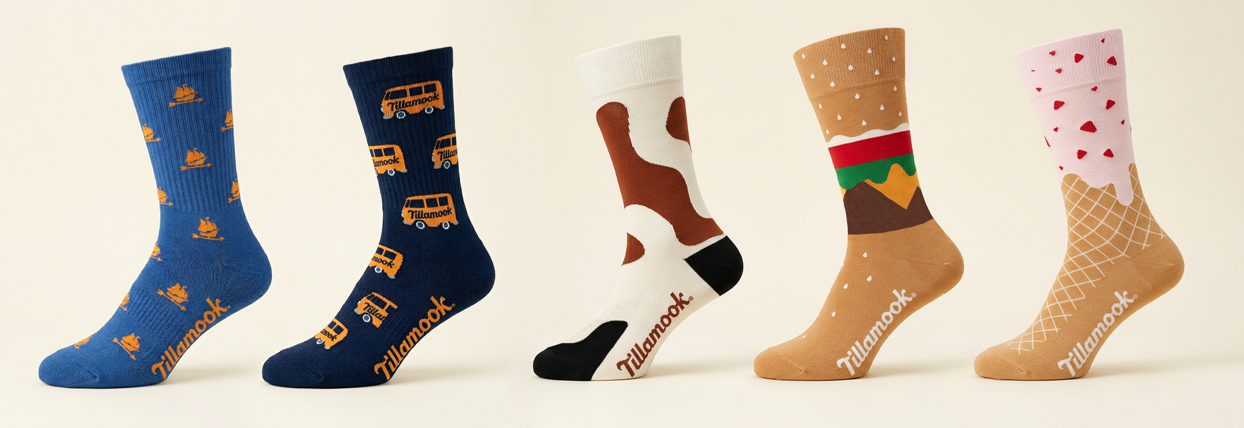
Tillamook Creamery socks were designed across toddler through adult sizing, with graphics and patterns developed specifically around the technical capabilities of knit construction. The designs go beyond surface graphics, using the structure of the sock itself as a design element to create more complex and considered concepts. I worked directly with the vendor at OFI, a relationship I introduced to Gifts and Food Buyer Jessie Li, serving as the primary point of contact throughout production.
MERCH APPAREL
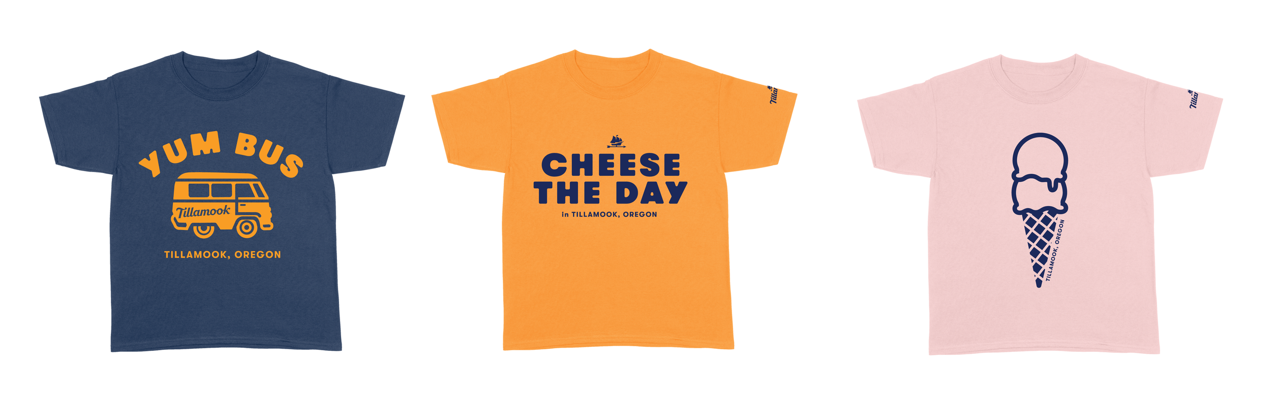
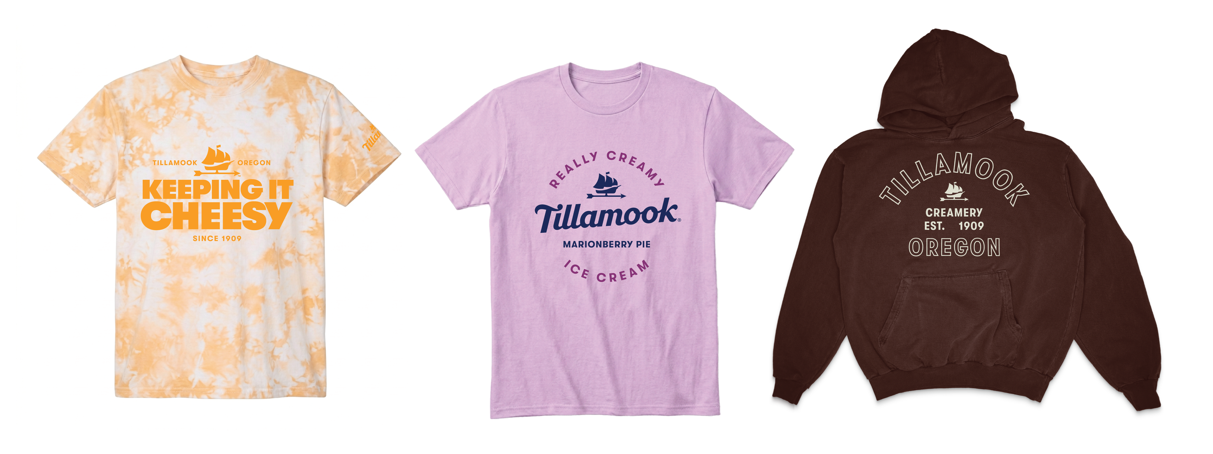
For the Tillamook Creamery apparel program, I built a strategic collection framework organizing launches across brand specific, product specific, and theme driven collections based on high point sellers. All graphics were original illustrations spanning adult and kids tees. Below is a small sampling of work across the years.
EMPLOYEE UNIFORM REFRESH
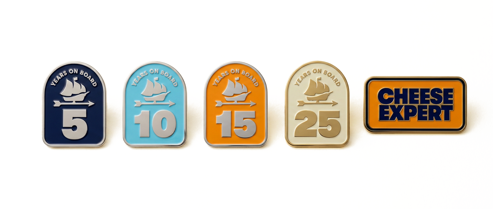
The uniform refresh crossed retail and front of house to chefs and brand ambassadors, researching components for budget, wash and wear, and heat exposure before delivering a full deck with recommendations, artwork, and production files covering custom aprons, accessories, tenure and identification pins, bandanas, and name tags. Project was managed by Director of Direct Commerce Deanna Hirt and Gifts and Food Buyer Jessie Li.

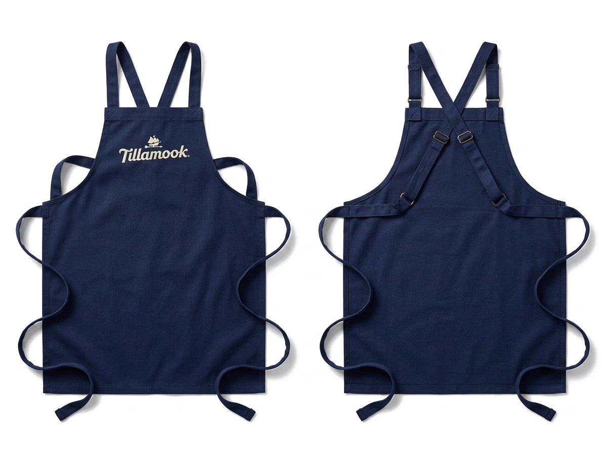
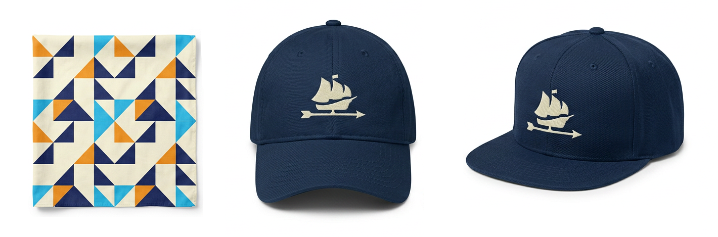
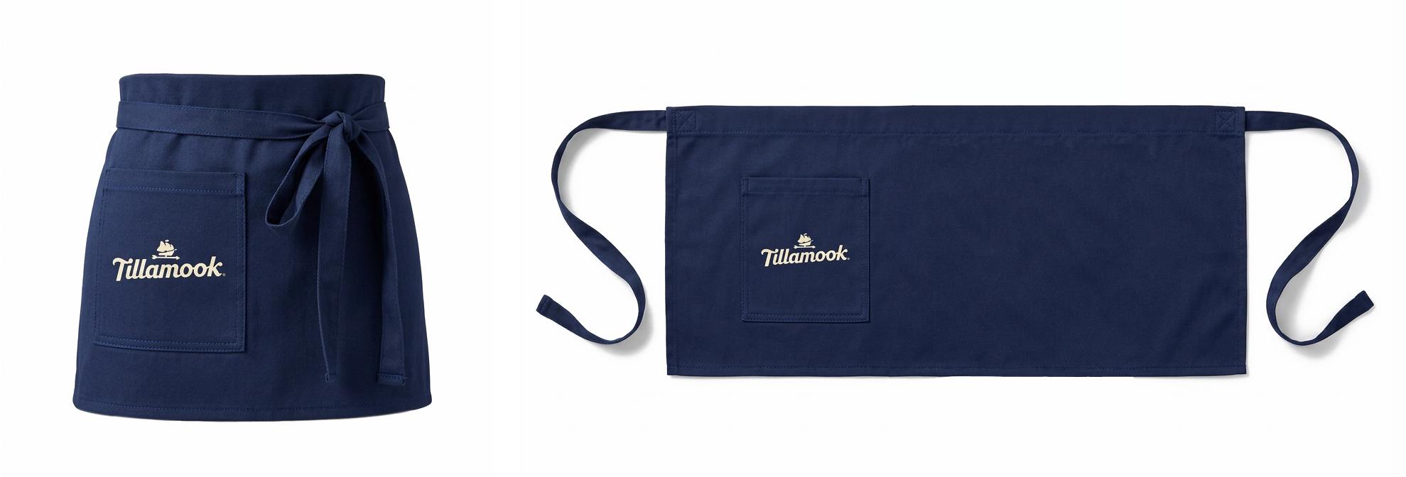
Aprons designed by Felicia Cantu | manufactured by PGF