Barnes and Morgan Tea and Threads is an independently owned tea and fashion house in Portland’s historic Old Town, founded by Amir Morgan. The 2100 square foot space inside the landmark Merchant Hotel blends intentional tea service with a bespoke apparel collection rooted in old world tailoring and early 20th century aesthetics. I have been working with Amir since the beginning, building the brand identity and expanding the visual language across every touchpoint of the space.
JUMP TO: BRAND IDENTITY | PHYSICAL SPACE | PRINT AND DIGITAL | PACKAGING
BRAND IDENTITY
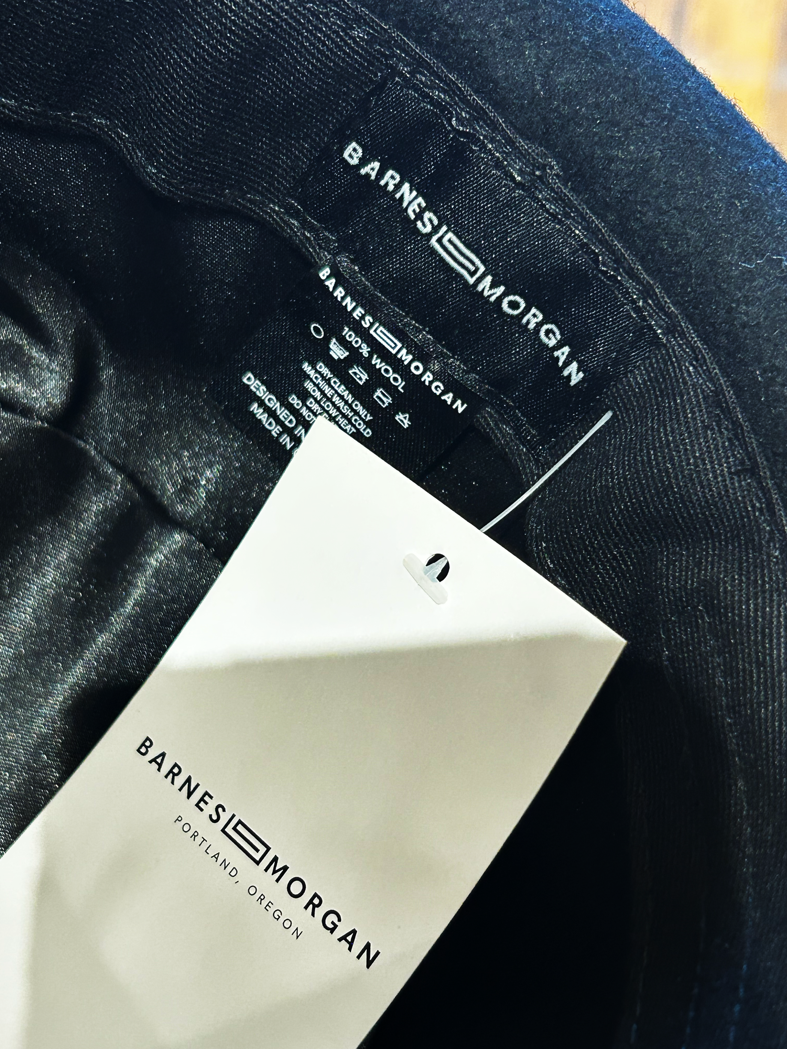
The Barnes and Morgan logo mark was developed to carry personal meaning without being overt. Drawing from the Arabic written form of the word “and,” which reads as a fluid swirl, I incorporated that form into the mark as a quiet nod to Amir’s identity and heritage. The logo needed to work broadly across apparel, environmental signage, and events, so the mark was kept versatile and unencumbered while still feeling considered and distinctive.

CONCEPT EXPLORATION EXAMPLES:

IN SITU


PRINT AND DIGITAL
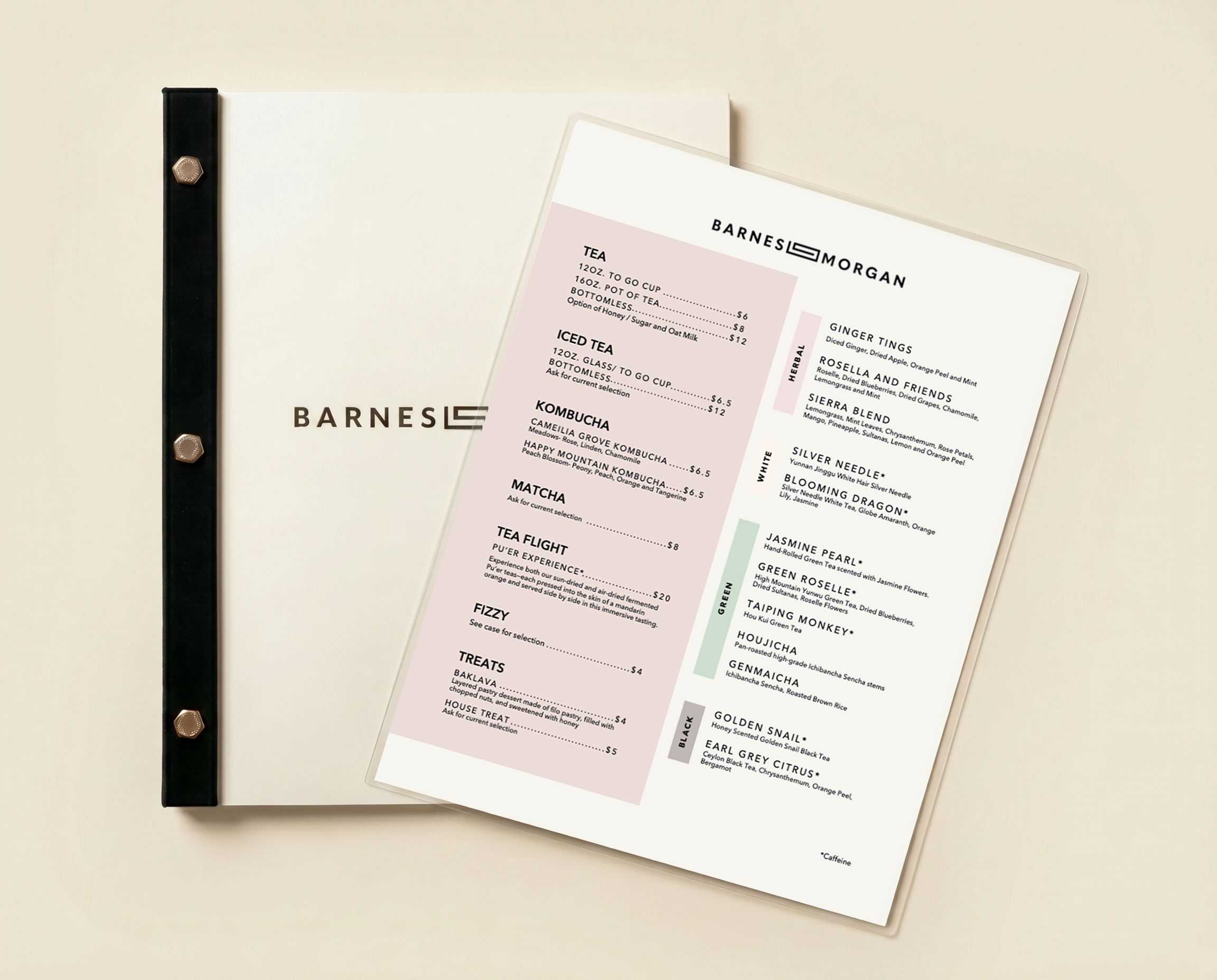
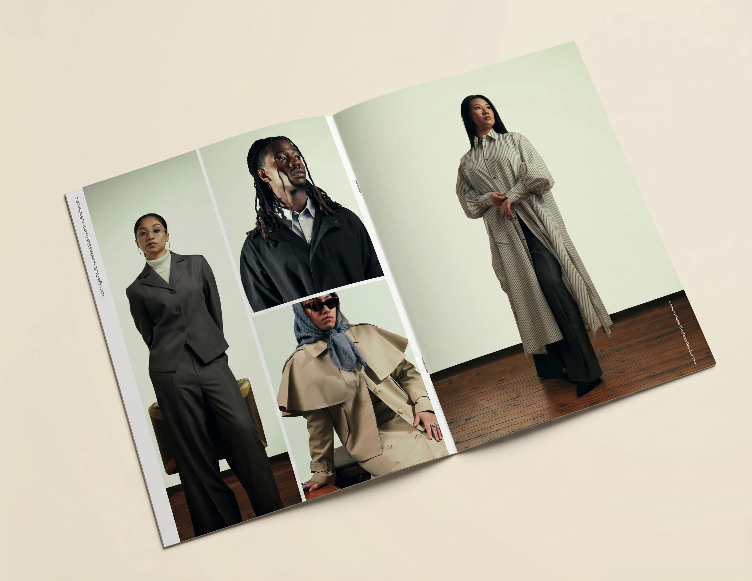
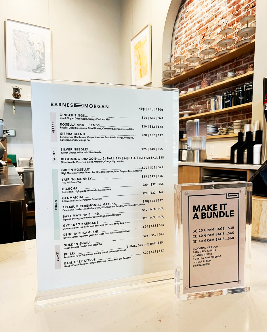
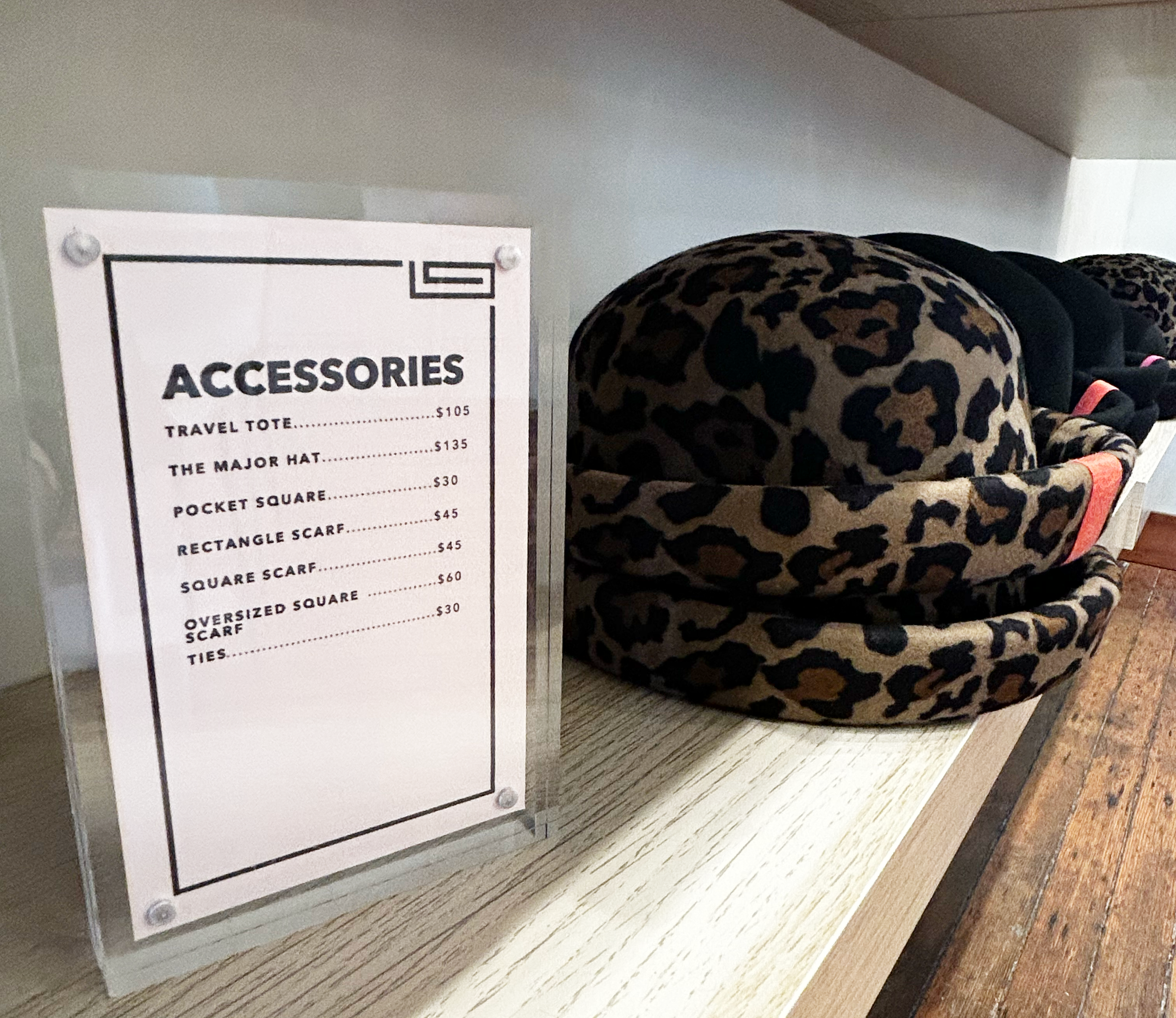
Print and digital work spans menus, retail pricing, and general signage built within the Barnes and Morgan brand identity. Given the range of tea categories, color blocking was used throughout to make the menu easy to navigate and visually distinct at a glance. Beyond standard signage I also designed a handmade tea book with industrial screw binding, featuring original photography I shot of every tea in the collection alongside sourcing information, flavor profiles, strength, and ingredients. A lookbook was developed for the most recent apparel line, and a suite of internal operational documents were created for staff including recipe guides and how to references for day to day shop management.

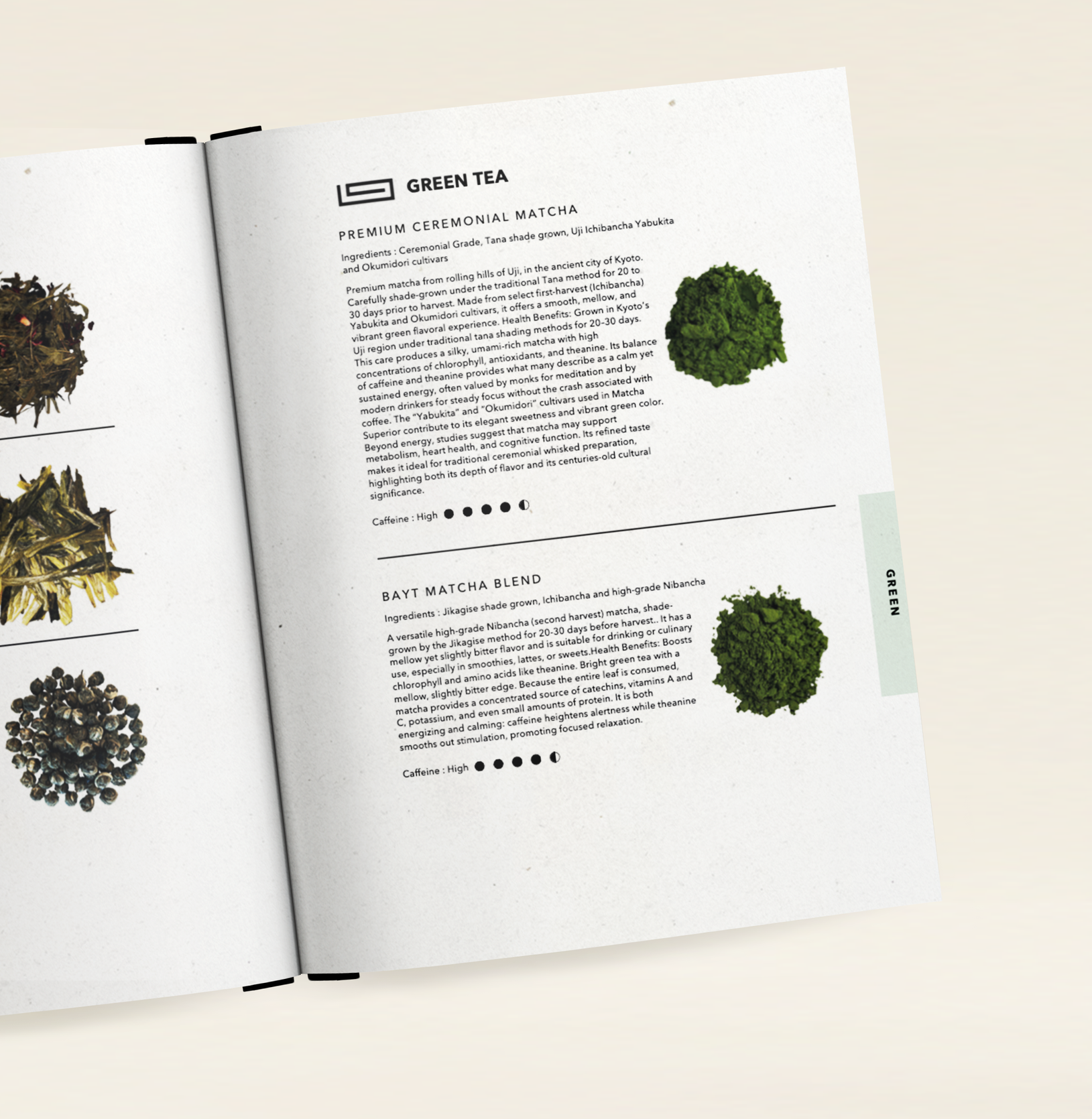
Inside Tea Book
PHYSICAL SPACE
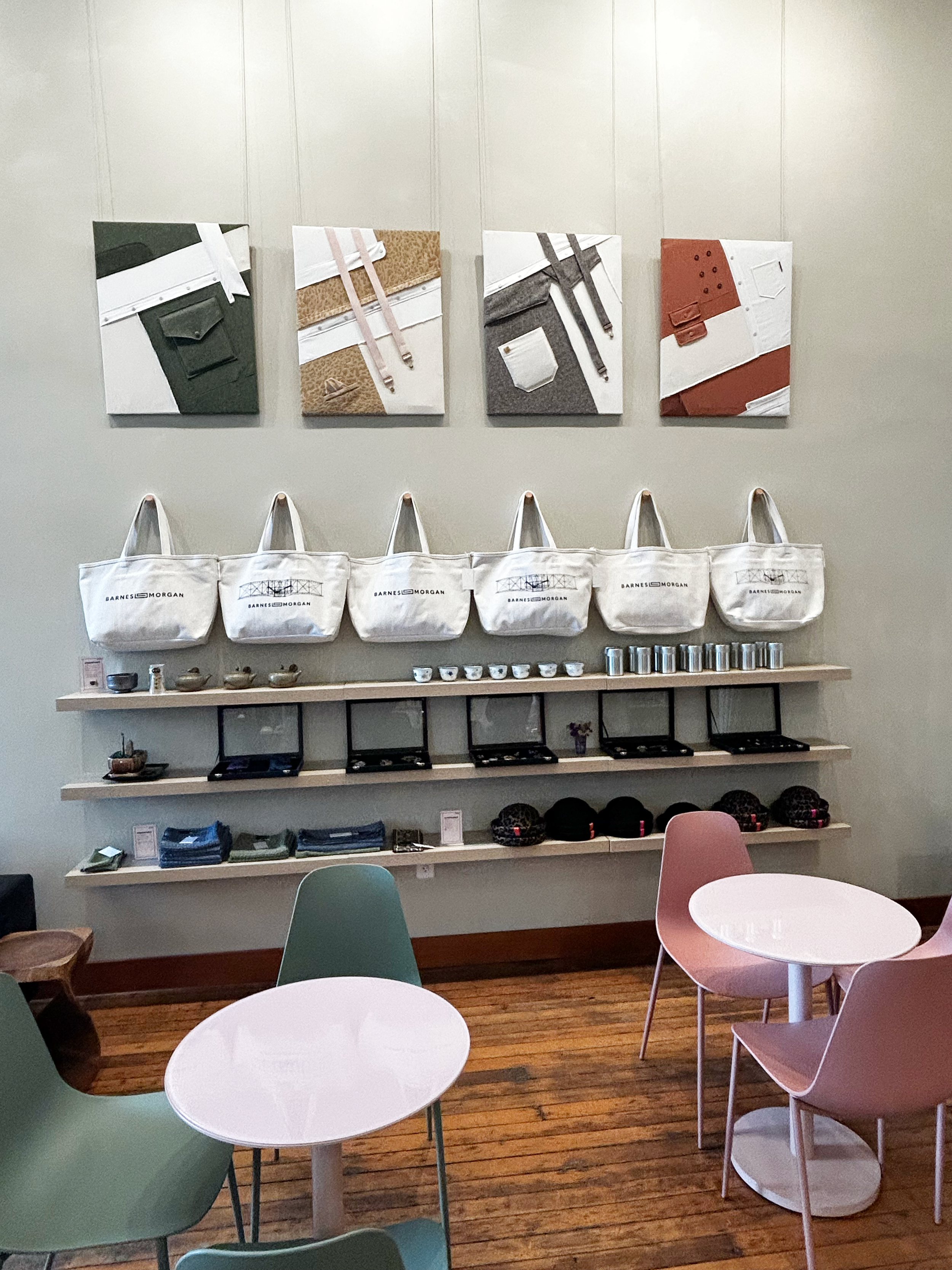
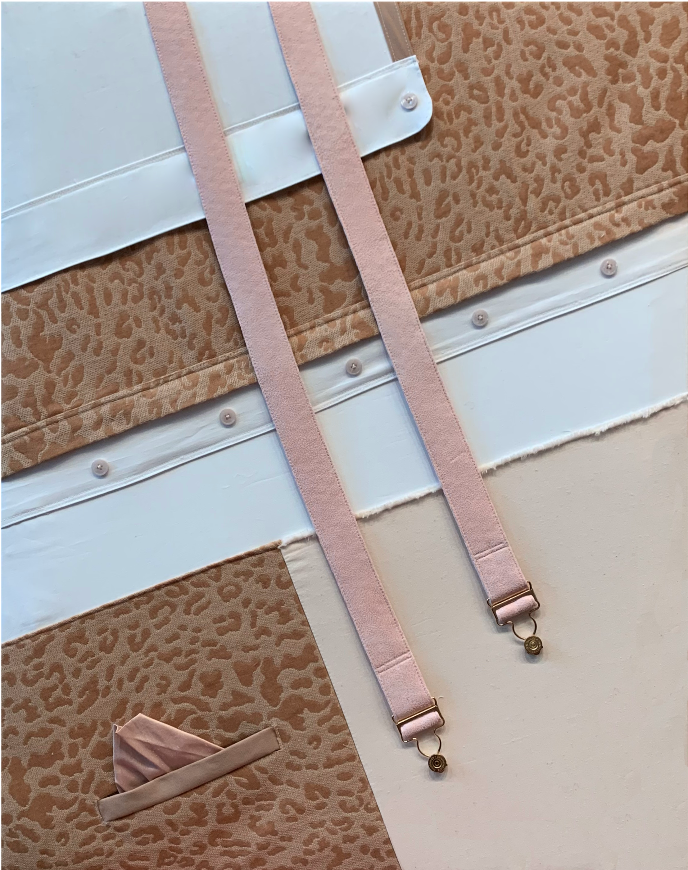
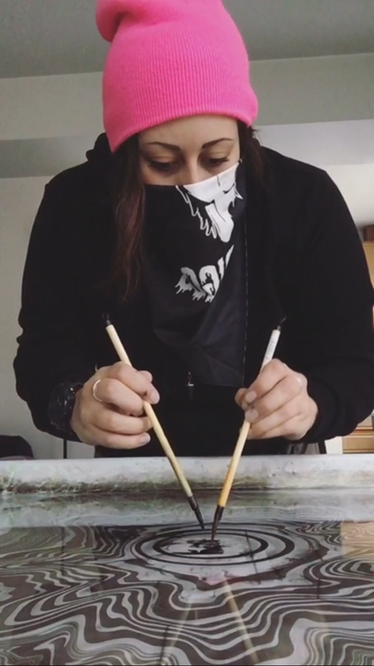
Physical space work for Barnes and Morgan spans window treatments, A frame design, and original artwork throughout the shop. I created four custom sewn textile pieces that reference the apparel aesthetic and color palette of the space, and contributed a series of original Suminagashi prints hung throughout the shop that align with the soft, considered palette of the environment. Environmental work also includes vinyl window treatments and retail signage consistent with the brand identity.

HANDMADE ARTWORK


PACKAGING
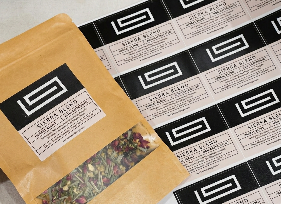
I designed a tea label system built for in house production, with individual print off labels per tea flavor carrying brewing instructions, product description, and website information, allowing Amir to source teas flexibly without being locked into custom branded packaging.